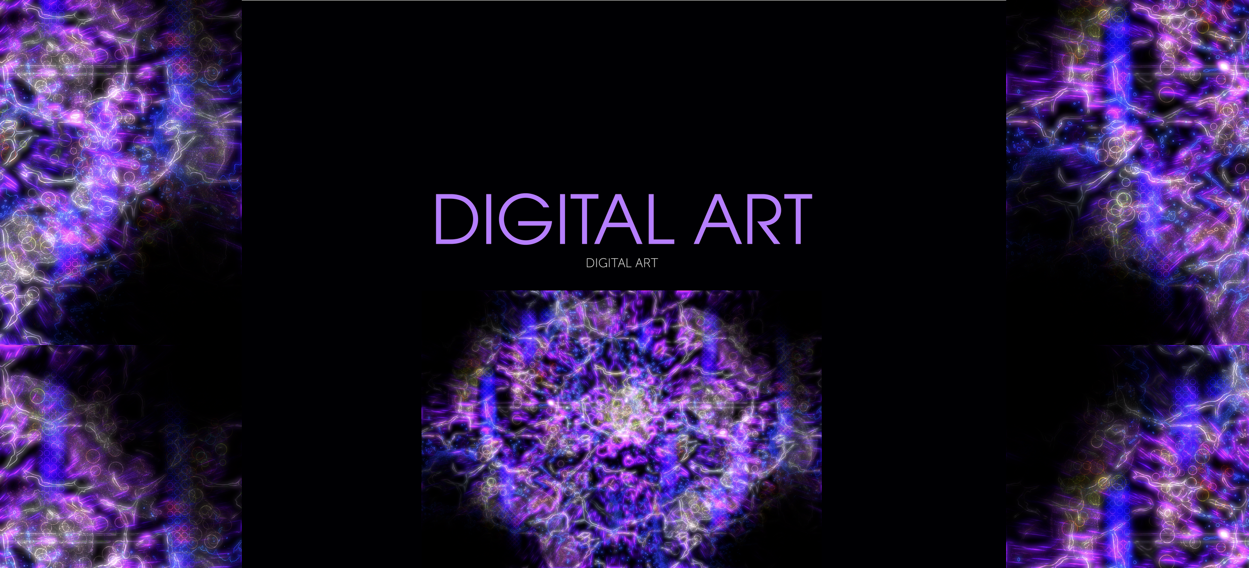
Before I was a designer, I was an artist, and I continue to work on art in my free time. This is a gallery of my best digital artwork which I will update as I make more work.
Violet
2022
This piece started with a relatively simple illustration. I kept adding more color and effects to it until it eventually became the version depicted here. I had a few different versions of this piece that I had by the end of my process with but liked this one the best because of its electric energy and vibrant colors.
Bloom
2023
This piece is the result of me experimenting with kaleidoscope effects, flower and butterfly shaped brushes, and pastel colors. As a result, this piece has a very different color palette than most of my other experimental pieces, which tend to be brighter.
Twisted Garden
2023
This piece came from the same original work as “Bloom,” but with different effects applied to it. It lacks the kaleidoscope and fading effects, and instead features inverted colors and different textures. Most of my work uses brighter colors, but this piece has darker and less saturated colors, giving it a creepier feel.
Teal
2021
This piece was originally a simple illustration that I then put into a grid and experimented with different perspectives. I find that often times my best work comes to me when I don’t have an end goal and am just experimenting, and this piece is a very good example of that. I had a version of this piece that I added more elements to, but it I felt like that version was too overwhelming, so I stuck with this one.
VCB
2022
To create this piece, I took a photo of a person and tried to see how many effects I could add to it before it no longer remotely resembled a person. I attempted this a few times, starting from the same photo, and this piece was the best result. I often have trouble naming these non-objective pieces, and so the title comes from me randomly typing three letters that happen to be next to each other on a keyboard.
A Cloudy Day in London
2018
This piece was made by manually rotoscoping a photo I took while on vacation in London two years earlier. This took me an incredibly long time to do even despite the fact that I chose to simplify many of the shapes found in the original image. Ultimately I think that the most effective part of this piece was the simplification of the background shapes contrasted with the more complex depiction of the bridge.
Alligator
2020
Using a similar rotoscoping process as with “A Cloudy Day in London” but with Procreate rather than Adobe Illustrator, I wanted to capture a photo I took of an alligator while in New Orleans. This took even longer to do than the former project, as each scale on the alligator is at least one, if not multiple shapes. The water was the hardest part, as trying to simplify the non geometric shapes within it was difficult. This time, making the background much simpler was a deliberate choice, and as with “A Cloudy Day In London,” I like how the simple background contrasts with the complex alligator.
Escape 4
2020
This was part of a series I made during the Covid-19 Pandemic called “Escape,” inspired by a longing for freedom and my desire to be anywhere other than quarantined in my house. The piece was compiled together in various programs before being finalized in Procreate. It was also part of an exploration into a psychedelic aesthetic, which I tried to do in this piece without using color.
Background Layer
2021
This was originally supposed to be part of the “Escape” series but it evolved into something else. I never came up with a name for it, so it’s named for the default layer name in Procreate.
Escape 6
2021
Drifting away from the original intention of the “Escape” series, I wanted to make a piece that depicted the complex relationship between emotions. I think the end result is a little bit cliche, but I also find it fun to look at. The background of this piece was the first time I made something with the effect experimentation process I use heavily in later work, and I regret that it’s not more prominent in the finished piece because I think it’s the best part.
Escape 8
2021
The last, and in my opinion strongest, piece in the “Escape” series, “Escape 8” has a more metaphorical representation of escape using brushes and effects. I wanted to continue to use the gold and purple that had been prominent in the background “Escape 6” to tie the two pieces together, and I somewhat inadvertently ended up creating the illusion of outer space.
Ember
2022
The process of making this piece was actually somewhat similar to “VCB,” except instead of starting with a photograph I started with a drawing I had made. This piece ended up being a little bit less transformative and using less effects than “VCB,” but I’m still satisfied with the end product. The name comes from the bits of red, which actually weren’t in the original drawing.
Mandala In Blue
2018
This was one of the first things I ever made using Adobe Illustrator and was made by creating the “slice” individually and then copying and pasting it. The version depicted here is not the original version but a redesign made more recently that was cleaner and more cohesive than the original.


