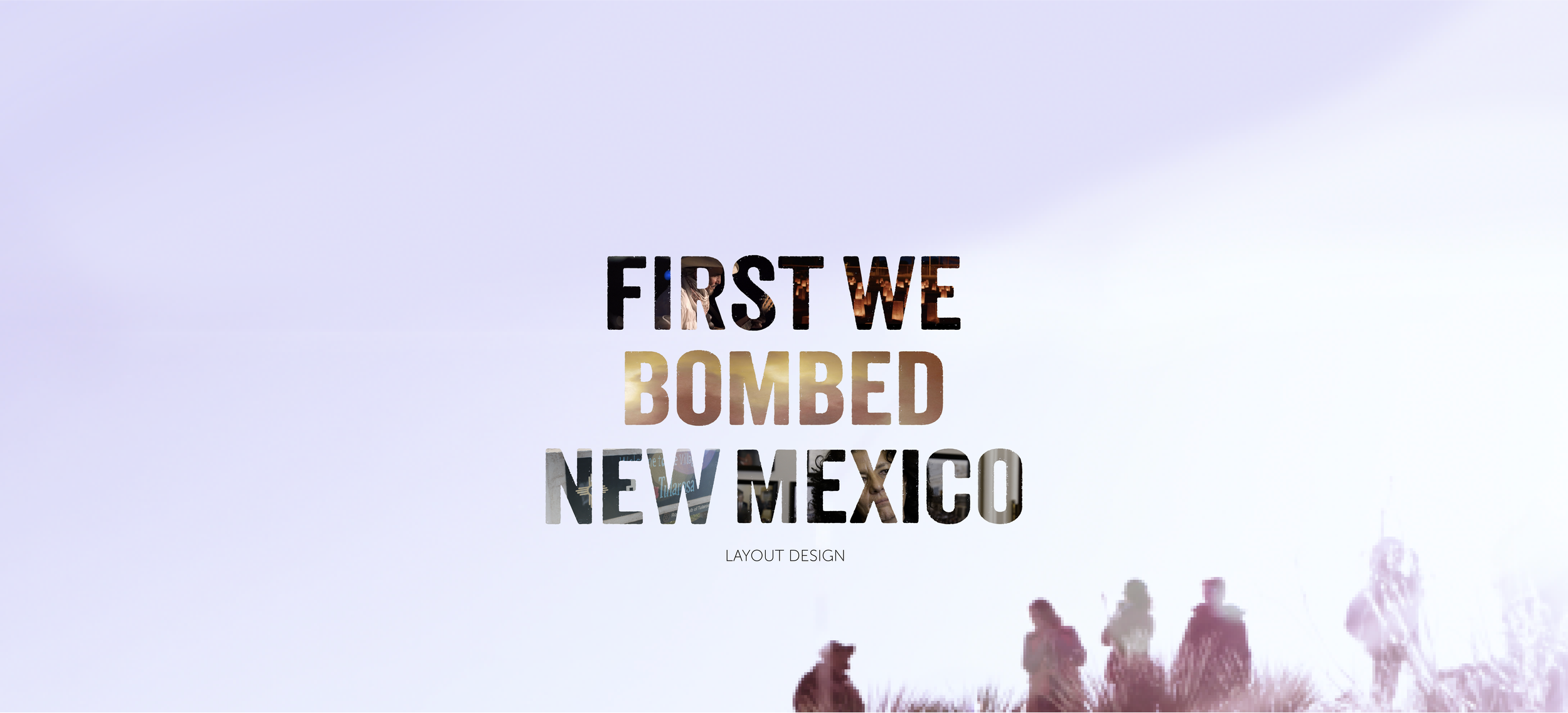
Goal: Create an unofficial poster for the upcoming documentary First We Bombed New Mexico.
Roles: Created poster concept, chose type and images to use, developed poster in Photoshop, wrote tagline.
Concept
First We Bombed New Mexico is a 2023 documentary film about the “downwinders,” or those suffering from the long-term consequences of America’s nuclear testing in New Mexico. I was assigned to work on this poster before the film was officially released, so it was made up of stills from the film’s rough cut.
Although I wanted to highlight many of the people affected by the radiation, I wanted to avoid making a movie poster that was a collage of people, because those are all over the place these days and are reminiscent of super hero movies, which I though would be inappropriate for this documentary. I have seen the idea of putting images in the text in documentary posters before and I thought it would work well here. I chose five images from the film that I thought would best represent the story and put them within the text, over a plain image also from the film.
Process
Figuring out the concept of this poster took a lot of time. Once I had that figured out, the hardest part was choosing which images and what font to use. I ultimately settled on five different images from the film, two of people affected by the radiation, one of candles used to signify those lost to cancer, one of the Trinity explosion, and one of the town of Tularosa, New Mexico. The background image was chosen because its simplicity would not distract from with the text.
The first and admittedly very rough draft used the font Cooper Black, which was in retrospect a big mistake. I chose it because I thought it was bold enough for the images to be visible through and is reminiscent of a small town. However, it looked too friendly. The next draft of the film used the font Interstate, which was closer to the feel I wanted but still not quite there. Interstate, however, is still featured on the final version of the poster for the tagline and “coming summer 2023.” The final draft uses a modified version of the font Veneer. Although Veneer had the correct feel for the poster, the font is very narrow and has many holes in it, and so for the poster I filled these holes and made the font wider. One thing I also implemented in the later drafts was the expansion of the bottom image into the top of the poster, as the bottom image actually only takes up about the bottom third of the poster, the rest is recreated.
In the tagline I wanted to emphasize the fact that the horrors of Trinity were done by Americans to Americans. I used the words “home soil” to indicate both that America was attacking itself, but also that the soil was literally irradiated.
You can learn more about First We Bombed New Mexico here.


