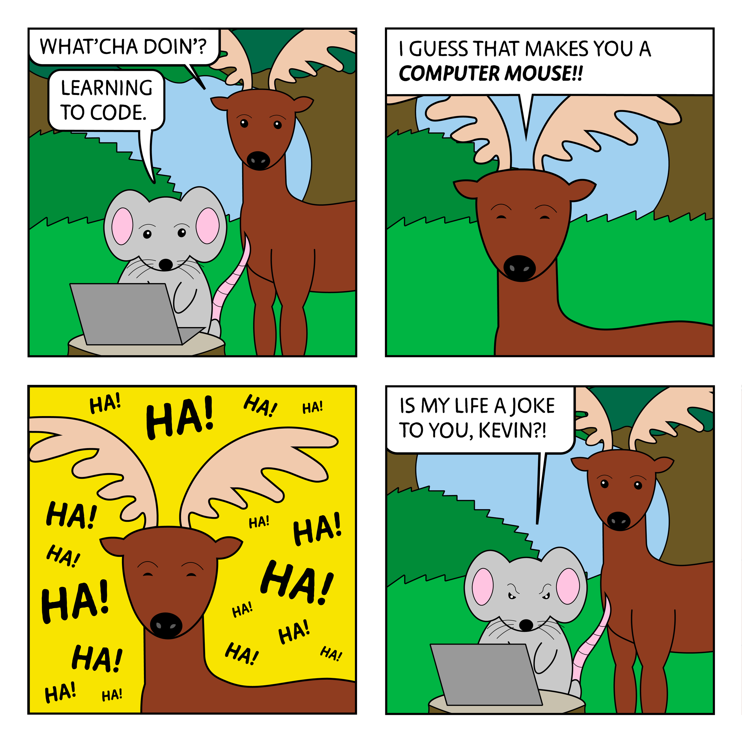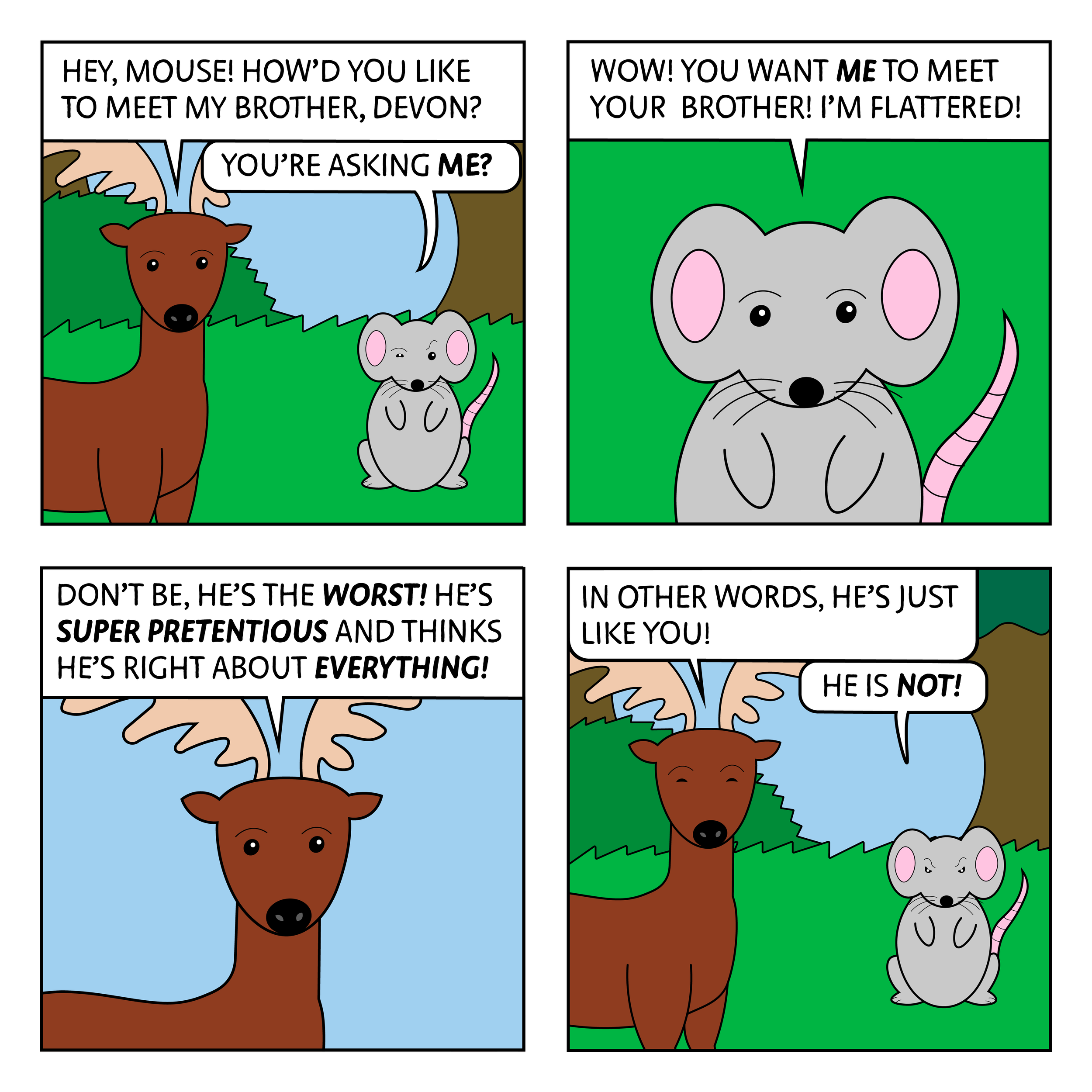
Goal: Create several installments of an internet webcomic.
Roles: Created all concepts, characters, and jokes; designed and illustrated characters and backgrounds; chose all colors and type.


I grew up on comic strips. I had collected editions of Calvin and Hobbes, Peanuts, Pogo, Big Nate and others that I would read and reread for hours. It didn’t take long for me to start drawing comics of my own and make my own characters. Eventually, I also became a fan of many internet webcomics, such as Cyanide and Happiness and Mr. Lovenstein.
I came up with the idea for Mouse Comic in my high school pre-calc class. I was one of two sophomores in a class otherwise full of juniors and seniors, and while the other sophomore was treated as a genius, I was more or less ignored, even though neither of us was really that much smarter than the other. I wanted to write about the feeling of being ignored, and so I came up with the idea of using a mouse to symbolize that feeling. The rest of the comic came naturally after that. I sketched four comics in class and then promptly forgot about it.
Years later, I decided I wanted to make a webcomic and revisited the idea of the mouse since I thought the art style and blunt sense of humor would be well-received by the internet. I created digital versions of the original four comics and then began to work on more new ideas.
No one comic I’ve read served as the main influence behind this project, rather every comic I’ve read had some level of influence. This included newspaper comics like Pogo and Calvin and Hobbes, older webcomics like Cyanide and Happiness and Mr. Lovenstein, and newer webcomics like Maurice the Beaver.


Concept
Process

The original sketch for one of the comics next to the finished version.
The first step I took in bringing my sketches to life was creating color designs for each of the characters. I took elements of the original style but changed a few things, such as making the characters more geometric and giving them with pupils. I also wanted to create some basic emotions for each character. The characters don’t have visible mouths, so I had to create recognizable expressions using just their eyes.

The strip’s main character is, of course, the mouse. The mouse is quiet but confident, and is highly intelligent. However, they are often overlooked and ignored by the other characters in the strip, even though they are usually right. As such, the mouse serves as kind of a Cassandra character; they often warn the other characters of upcoming danger, but nobody listens. However, the mouse is usually vindicated when their warnings come true. The mouse wants to get along with the other characters, but the others don’t really take them seriously.

The mouse most frequently finds themself in contact with Kevin, a deer. I called him “Kevin” because I wanted to give him a generic-sounding name. Kevin is a loud and brash character with fairly low intelligence. He gets a kick out of bothering the mouse, and he thinks he is hilarious. Kevin can often be found hanging out with his best friend Francisco.

Although he appears to be a fox, it’s made somewhat unclear in the comic whether Francisco is a fox or a wolf. Francisco is quieter and calmer than Kevin, and he usually only bothers the mouse if he’s following Kevin’s lead. While Kevin and Francisco appear to be close friends, Francisco’s true motivations remain somewhat of a mystery.

The last character who appears in the strip is the lion. The lion appears very majestic and stoic but is actually quite lazy and spends most of his time napping. Although the lion has a very high opinion of his own intelligence, he tends to stop doing a task when it requires any substantial effort, thus making his actual intelligence unclear. I didn’t make sketches of the lion’s emotions because he never really expresses any, with his face often displaying a blank and lazy stare.


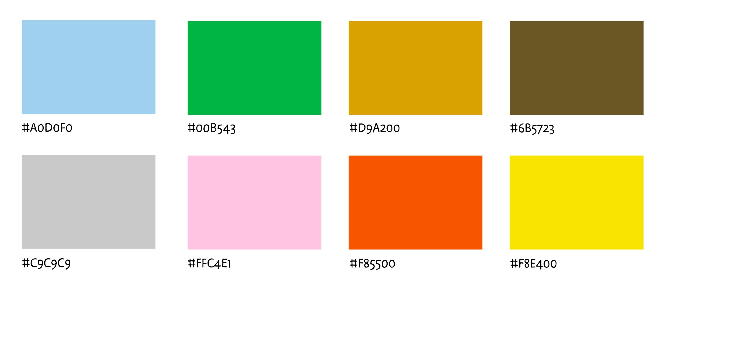
The character sketches informed the strip’s visual identity. I chose to use a lot of bright colors, since duller colors would look strange contrasted with the bright character designs. Any text in the strip is in the typeface Duper, which I thought not only resembled traditional comic lettering but also my handwriting. I used the bold italic form of the typeface when a word required emphasis.

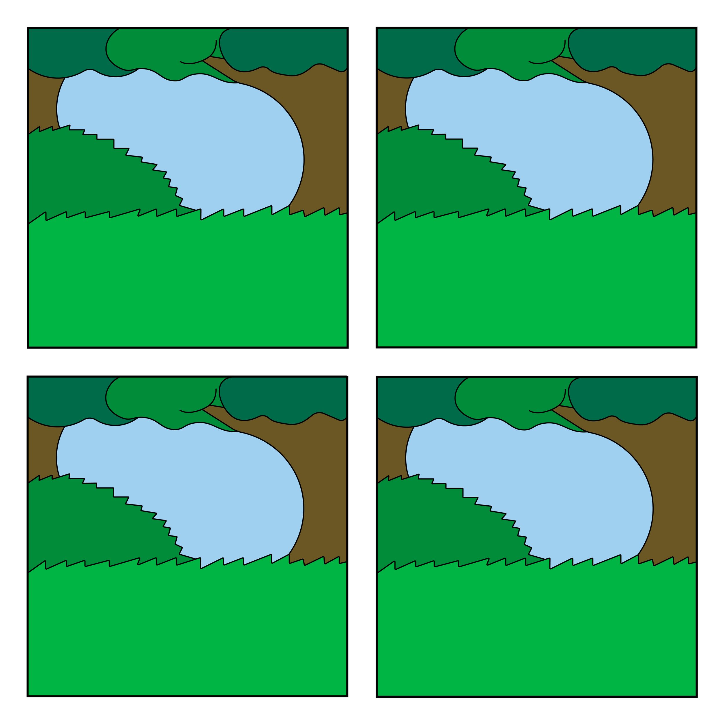
Since the strip mostly takes place in a forest, it didn’t make sense for me to design multiple backgrounds. I designed this relatively neutral forest background as a default, although some panels have a solid color background or use this background with a night setting rather than day.
Assembling the strips proved fairly simple after designing all of the elements. The characters are not particularly mobile, and so the same basic image of each character is used in each comic, with variations in the scale and emotion. Although the characters’ original designs feature shading, I quickly eliminated this element once I realized it would be too complicated to shade the background as well. The characters also were cleaned up from their original sketches so they better matched the environment and wouldn’t pixelate when scaled.
The last step was to give the comic a name. The original sketches were under the title “The Mouse That No One Listens To Even Though They’re Always Right,” but even though the I found the lengthy title funny, I thought the more simple “Mouse Comic” fit the comic’s blunt sense of humor better.
Although these comics have yet to be shared anywhere other than this website, I’m hoping to begin posting them online once my schedule gets less busy. I also hope to continue making more comics as I have storylines in the works and plenty of unused ideas.
You can read Mouse Comic below.


