Goal: To design a type specimen for a pre-existing typeface.
Role: Chose all colors, selected typeface, designed all layouts, and wrote all copy.
Concept
I first discovered the typeface Museo through its variation Museo Sans, which I began using in the earliest iterations of my personal brand and is still the primary typeface used in my branding. When thinking about a typeface to use for this project, I wanted something with multiple weights and variations. I thought back to Museo Sans and then to its parent typeface Museo, which I wasn’t as familiar with. I like the curved serifs of the typeface, inspired by metal beams, and its clarity and simplicity. At first, I was afraid I wasn’t going to be able to find enough information about Museo, but I then realized that I didn’t need much copy and that an emphasis on the letterforms itself would be better.
Museo is often used in web design and is frequently used by both amateur and professional designers. I wanted to incorporate basic web design elements into the design as well as commonly used web colors. The original version used a basic cyan, yellow, and magenta, but I decided that the yellow and blue were more evocative of web design.
Process
Above are three iterations for four of the five inside pages. These were the first four pages made for the type specimen.
The original version of each of the pages, at the top of each group, was very maximalist in its design style, but I realized after making it that it was way too much. Each subsequent draft was about reducing the number of elements in the design and making it clearer to read. Some changes made included a less intense color palette, less content on each page, and more consistent use of colors between pages.
The first spread, on the top left, was meant to show off the unique letterforms of Museo as well as explain a brief history of the font. Other than the subtraction of elements, this page did not change significantly from its original conception, and I think it effectively displays the typeface’s qualities.
The second spread, on the top right, shows off Museo’s weights. Although having weights in increments of 100 rather than labels such as “thin,” “regular,” “medium,” and “bold” is not something unique to Museo, I still liked the idea of emphasizing it, since it is unusual. This spread was changed more significantly, with the display of the typeface’s weights changed from being one page to two so the differences were more clear. Keeping the quote on the page was important to me because I liked that it gave a reason for Museo’s numbered weights, but finding a place to put it proved difficult, and I’m still not sure that where I did put it was the correct choice.
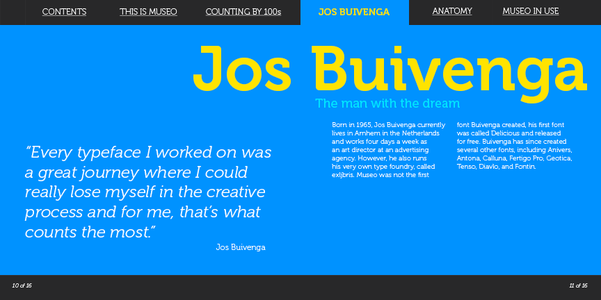
The third spread, on the bottom left, is about Museo’s creator Jos Buivenga. The most challenging part of the spread was again dealing with the quote, but ultimately I think my decision here was successful.
The final spread, on the bottom right, was inspired by looking at other type specimens, specifically type specimens made before computers. These specimens feature maximalist displays of the typeface with sample text, which I decided I wanted to adapt to a modern typeface like Museo. I spent a lot of time figuring out what words should be featured in this section, what weights and sizes they should be displayed in, and what order they should go in to create the most visually appealing layout. I wanted to use a lot of phrases that would be found on the sites that use Museo. Ultimately, I think this part was successful. However, the first page of the spread was less effective. I tried to align the words “Museo” and “use” so that the “use” in “Museo” aligned with “use.” However, all of the arrangements of these words in which this happened looked a little strange. I think the one I ended with was the best option, but it’s still a little strange.
In order to preserve the some of the content that had to be removed for clarity of the other pages, I created a fifth “anatomy” spread, which highlights some of the my favorite letterforms of the typeface and the differences between Museo and its other forms, Museo Sans and Museo Slab. The original version of this page, on the left, was on a white background, which I thought was more effective than the later version with a yellow background. However, I chose to change it to the yellow background for more consistency among pages and to avoid having the white background contrast too harshly with the dark gray background used in the previous spreads. Ultimately, this spread ended up being my favorite.
The table of contents was the hardest page for me to figure out. Ultimately, I’m still not satisfied with it. If I ever go back and rework this project, this will be the first page I redo.
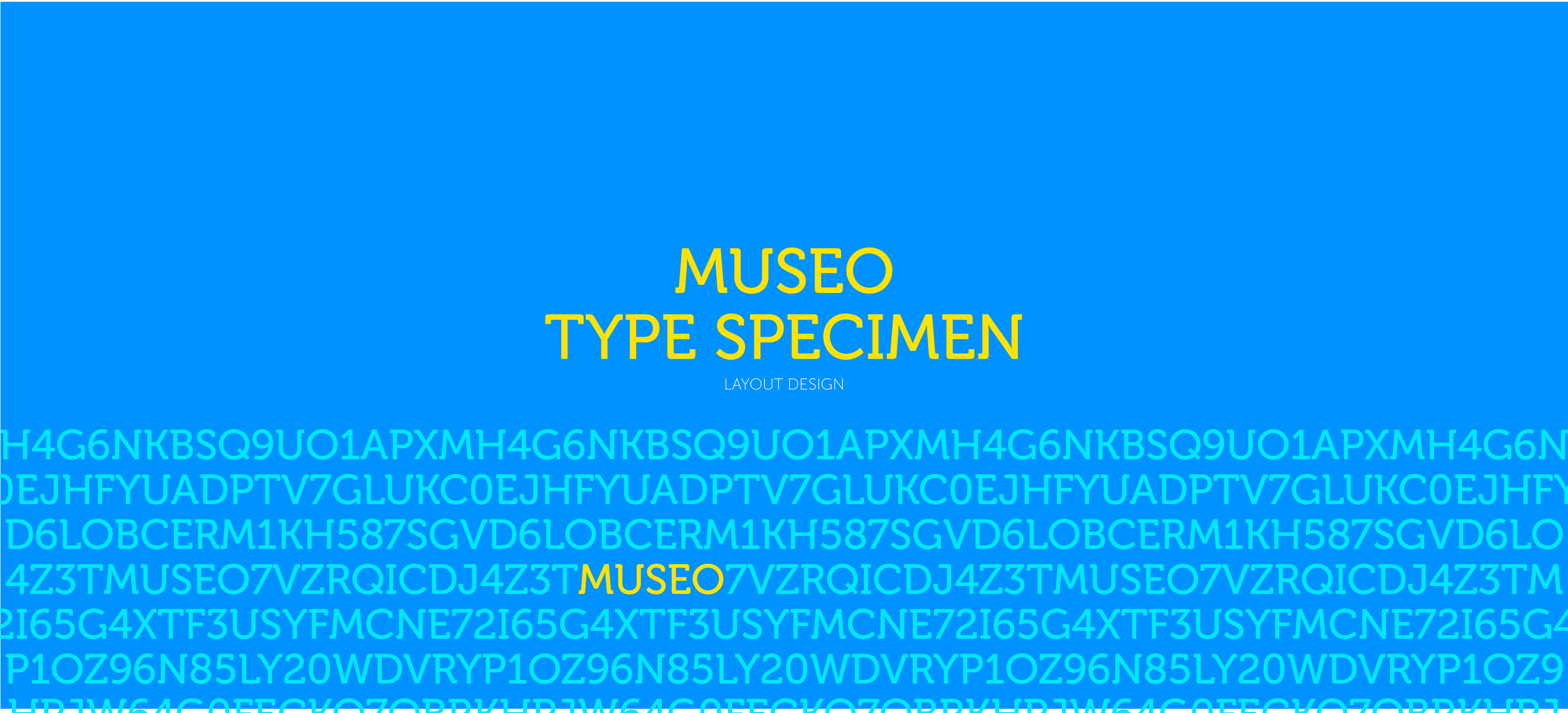
In contrast, the title page (left (desktop)/top (mobile) and cover (right (desktop)/bottom (mobile)) came much more easily to me. Originally, the former was the cover and the latter was the title page, but I thought that the bottom page was more visually appealing and made a better cover. The letters used on the cover were generated completely randomly by assigning each character a number and using a random number generator.
This project taught me an important lesson in overdesigning and how it can inhibit readability. It also, however, taught me the solution. Now, an important part of my design process is getting all of my ideas out and then deleting and modifying the ones that don’t work until I get a cleaner, more minimalist design. One thing that’s important to remember while going through this process is to not get overly attached to any design elements because sometimes things don’t work.
I also gained a greater appreciation for type and typefaces from doing this project, and I felt like I learned more about what makes typefaces unique and beautiful.
You can read the completed version below. The font Museo can be downloaded on Adobe Fonts or here, among other places.


