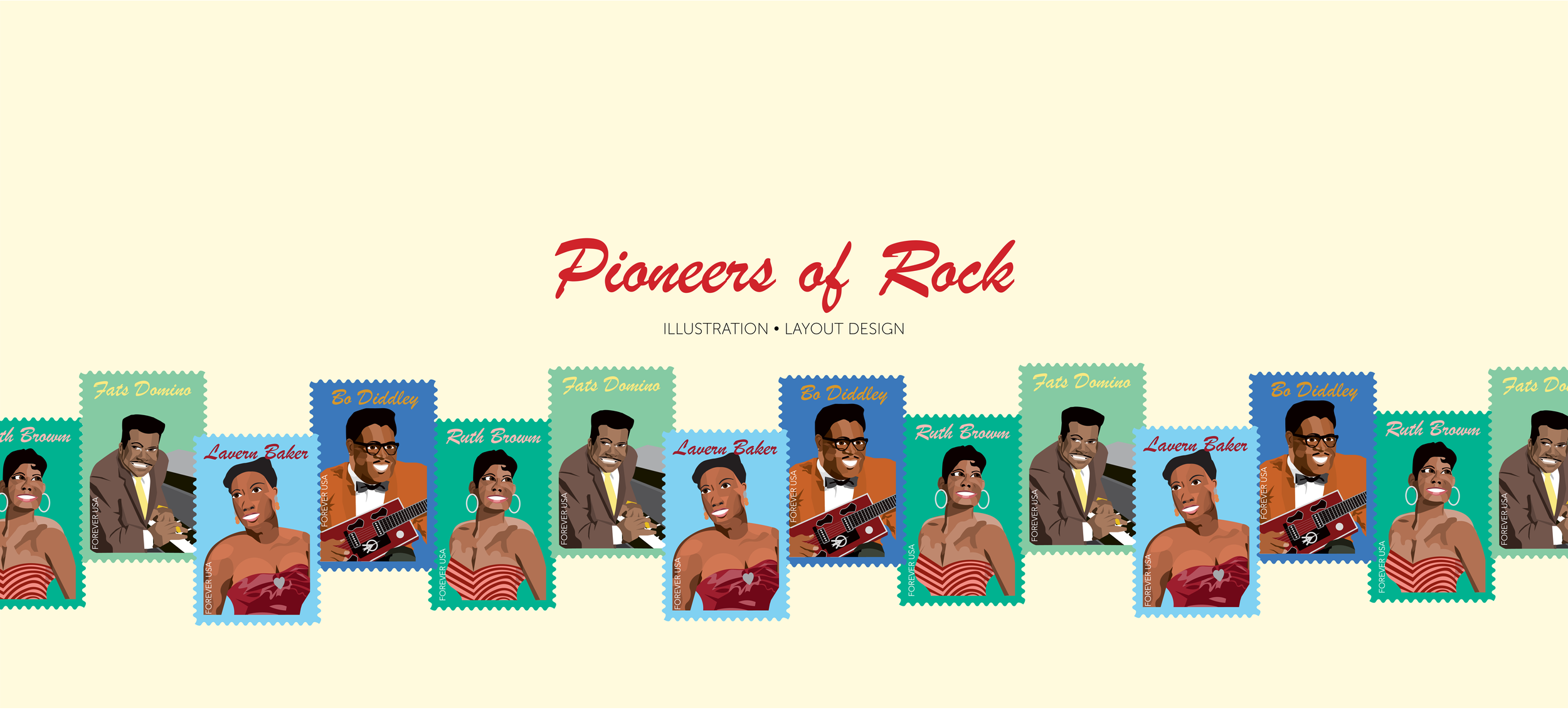
Goal: Create a series of four stamps that represent a significant piece of American culture focusing on an underrepresented group.
Roles: Created illustrations, chose type and colors, and assembled stamp pane.

Concept
The idea for this project came from my love of rock music, especially artists from the 1960s such as The Beatles and The Rolling Stones. In making this project I decided to focus on the artists who influenced my favorite bands and looked at the mostly black rock artists from the decade before. The purpose of this project was to highlight the African American roots of rock music, without which the genre would not be as we know it today. Choosing which artists from this time period to use proved difficult, as several of the great 1950s artists, such as Chuck Berry, were also very problematic people. I also wanted to make sure that some of the artists featured on these stamps were women, often underrepresented in the genre of rock. Fats Domino was the first artist I chose to represent, and the only one I knew much about before starting this project. After conducting more research, Bo Diddley, Ray Charles, Lavern Baker, and Tina Turner were all considered for inclusion, but I ultimately chose to portray Baker and Diddley. Ruth Brown the last artist added to this project, after I decided she represented the era better than Tina Turner.
Process


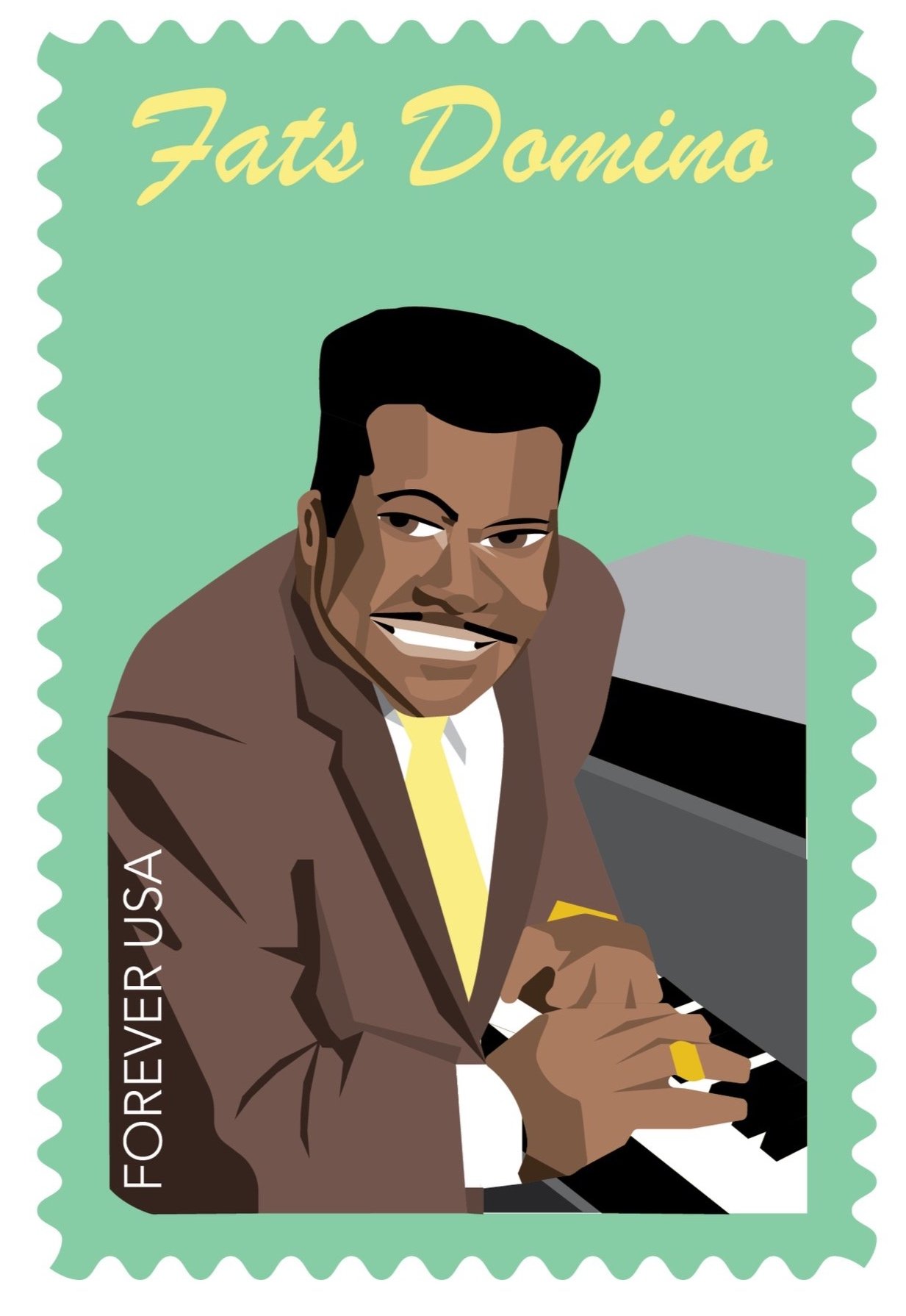
Trying to figure out what style to use for the illustrations proved difficult at first. However, I ultimately chose a geometric style. For each artist, a few images were selected to use as a reference, and I tried to capture the key qualities of the artists appearance as I saw it in these images. For example, for Bo Diddley, it was important to portray him with his iconic guitar. As depicted above, with each stamp I started by creating the musician’s face. The body then came next, then any background elements (in this case Fats’ piano). Lastly, a colored background was added along with the text. For the first draft of each stamp, the scallop (or edge) was originally a cream color, but I changed it to be the color of the stamp’s background to give the stamps a more clean look. I also reformatted the text so each musician’s name was bigger.
I wanted to depict a bright color palette for the stamps to evoke the lively feel of rock music. I chose a color to highlight in each stamp that was prominent in the images I saw of each artist, for Fats Domino, yellow, for Lavern Baker, maroon, for Bo Diddley, orange, and for Ruth Brown, pink. Each stamp also has a background, the color of which was chosen to contrast with that highlighted color. This created a gradient that was unintended, but not unwelcome.
The typeface used for each musician’s name is Brush Script MT Italic, which I chose because of its 1950s feel. The typeface for the words “forever USA” is Avenir, used because it is simple and goes well with Brush Script. The text on the stamp pane is in Garamond, which was also used to not take away attention from the stamps themselves.
One challenge I faced while making this project was time. I hadn’t allotted as much time for the stamp illustrations as was necessary and therefore had to spend more time on them than expected. Another takeaway I got from this project was that design often don’t go exactly as plan. I revised my vision for this project as I went along, especially in the beginning. However, I’m ultimately happy with the final version of these stamps.

The stamp pane.


