Goal: To design a cover, sample article, infographic, and website for a theoretical magazine about card games.
Role: Chose all colors, typeface, and images; designed all layouts.


Magazine
Concept
The original idea came to me after seeing magazines such as PC Gamer that were focused on video games, and I thought that a similar type of magazine for card games would be an interesting idea and a good design challenge for me. I play poker with my friends regularly, typically Texas Hold ‘Em, so this was also an idea that I had personal interest in. I also wanted to make the magazine concept as a whole appeal to not just poker players, but to players of other card games as well, even lower-stakes games like Go Fish. This would broaden a potential audience and also made the design process more compelling for me as it allowed me to be more creative with my articles.
Because I am not an expert on poker theory, and I was even less so when I was working on this project, I chose to make the focus of the main article my emotional connection to the game rather than an informational piece. I also felt like an explanation on poker theory was something that could be easily looked up online, while someone’s story is something that would be unique to the magazine.
Process
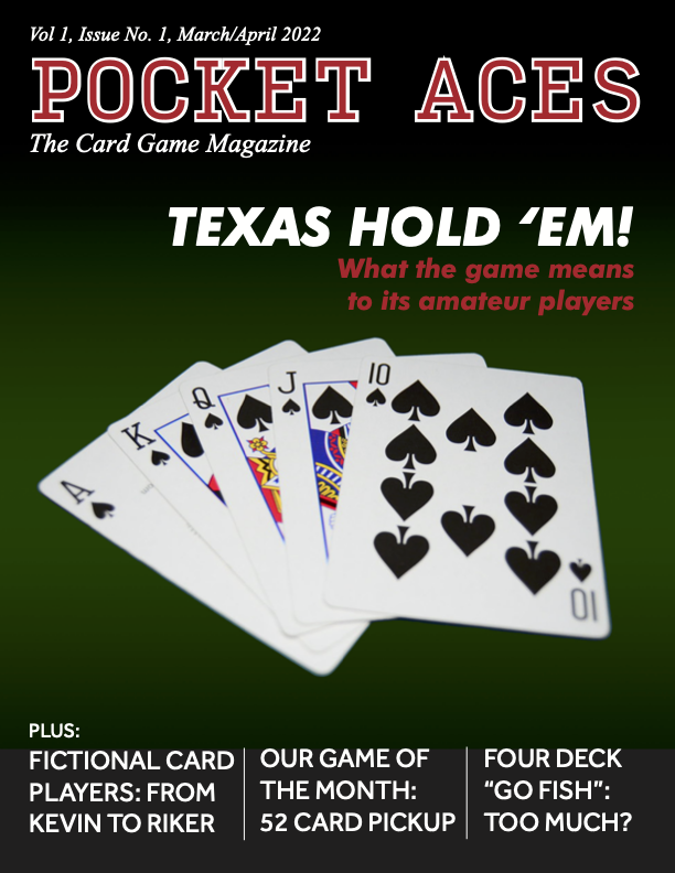


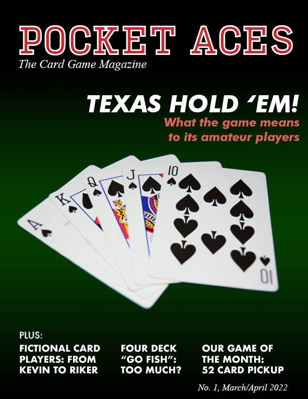
Unusually, the cover was the first part of the magazine I designed. The basic image used on the cover is a picture of a royal flush found on Unsplash with the background removed in Photoshop and a gradient I made added in behind it. I chose the royal flush because it is an arrangement of playing cards synonymous with poker, being the best hand in the game. The cover, and the remainder of the magazine, primarily utilize the colors red, black, white, and green, with the former being the colors of playing cards and the latter being the color of casino felt. The typeface used for the masthead is Input Sans Narrow, which I thought closely resembled the typeface of numbers used on playing cards. Also used was Times New Roman, which I thought made the magazine feel distinguished and real, and Futura PT, which I liked because of its contrast with Times New Roman. As can be seen above, most of the changes made to the cover after the earliest version had to do with establishing hierarchy and readability.
Even though only the main article was to be designed, deciding which other articles to tease on the cover was a very deliberate process. I wanted these articles, like the main feature, to be things that couldn’t necessarily be looked up on the internet. I also liked the idea of having them be a little bit silly.


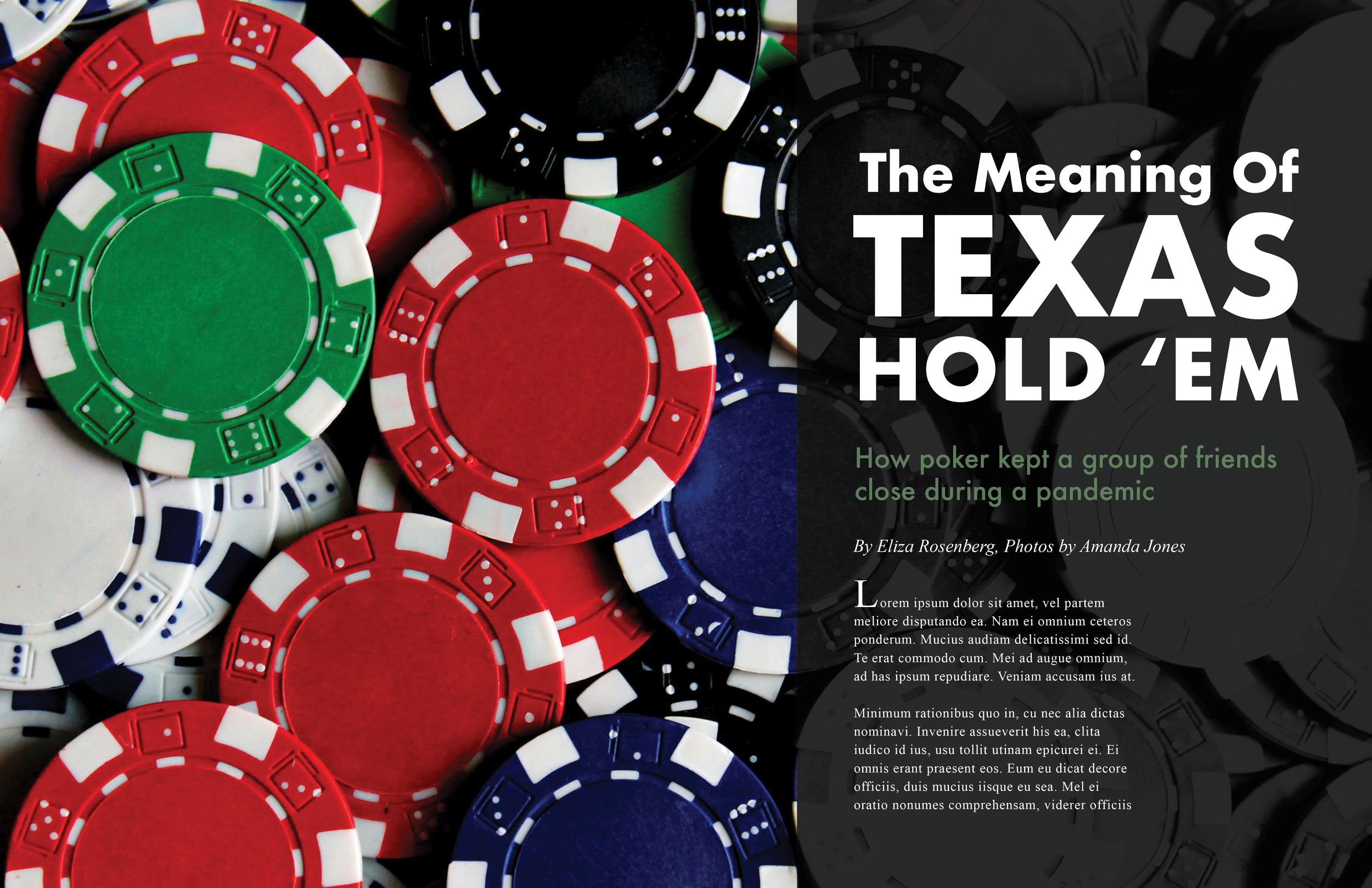
The original version of the article featured a different image on the second spread and more pullout quotes, but few other changes were made. Although the final version of this article has an actual story within it, the image posted here has filler text to protect the privacy of those mentioned in the article. The article spread uses typefaces and colors also used in the cover.

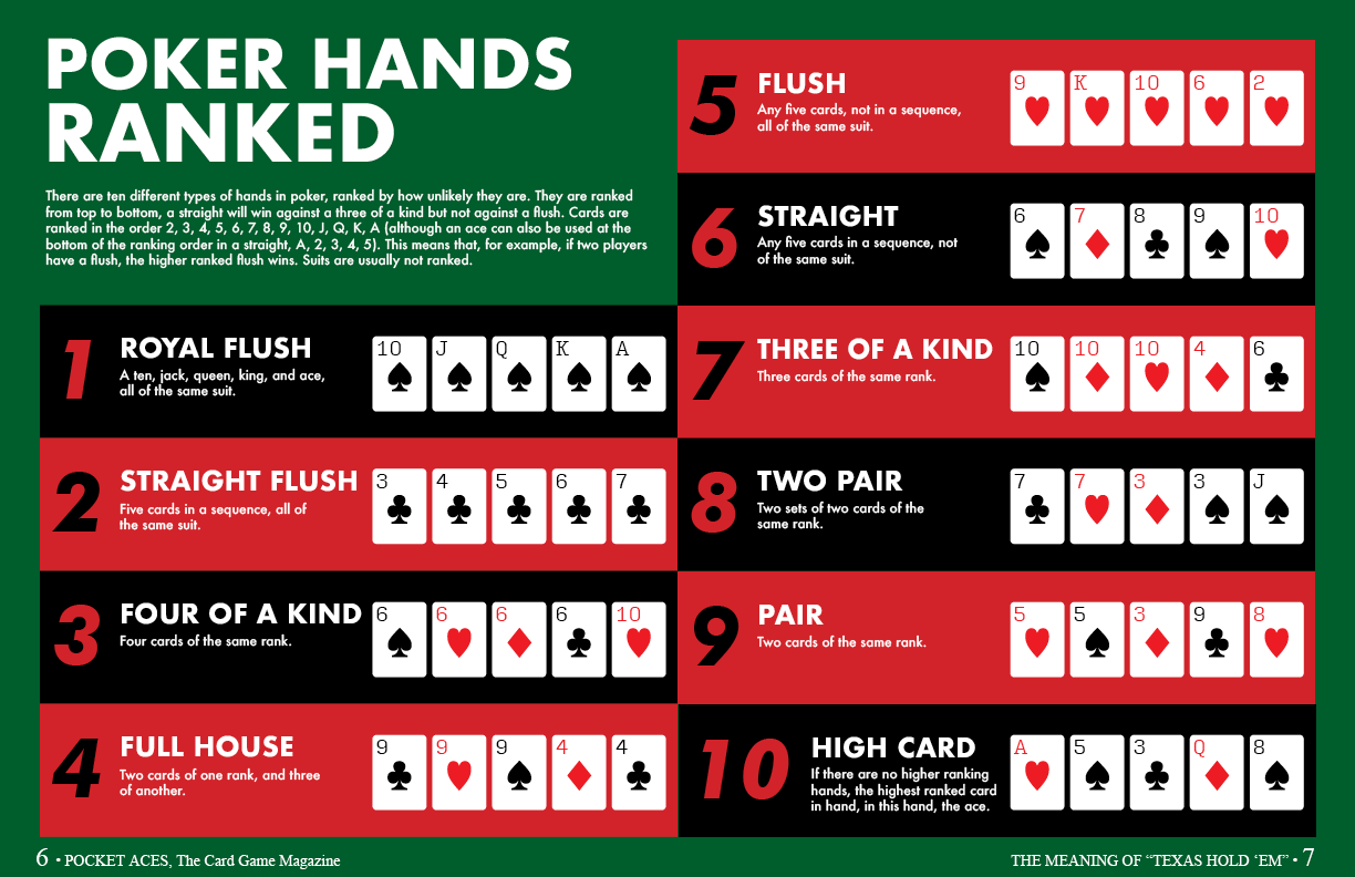
Even though most readers of this magazine would probably know the ranking of poker hands, I had always wanted to design a poker hands infographic, and it seemed like a logical infographic choice for a card game magazine. I’ve also since used this infographic to teach people poker. Originally, this graphic included yellow elements and was planned to have more complex depictions of the cards. However, this was too much, and I liked the simpler card depictions and reduced color palette better. Even though not every card in the deck is used in the graphic, I made assets for all of them.
Website


The site as displayed here is a mobile layout, and contains the homepage, some screencaps from the article page, the hamburger menu, the search bar, and a page for an article category.
For the site, I eliminated the green used in the magazine and used only the red, black, and white to make it feel more cohesive and minimalist. I also used less Times New Roman and more Input Sans Narrow because I felt the website didn’t need the same prestige look as the magazine itself and needed the clearer readability found in Input Sans Narrow and Futura. I also came up with more article ideas, largely based on what I could fit with the stock images I could find. For example, the article title “Fictional Card Players: From Kevin to Riker” wasn’t featured on the website because I couldn’t find an appropriate image to use with it. Like with the magazine itself, I made some of the articles a little bit on the sillier side. I also came up with the categories I thought the articles might be grouped into and thought it was especially important to have a category for non-betting games to appeal to the more casual audience I wanted to attract.
Redesigning the infographic was harder than I had originally thought and required removing the descriptions of each hand. Nevertheless, I still believe this version of the infographic works, and I have seen other poker hand infographics without hand descriptions.
A challenge when designing this project was transitioning the magazine layout into a web layout. Magazine articles are very individually designed, and so when designing the article for magazine it had to have a unique feel. However, for a website, most articles use the same template, so I had to translate the article to a web format that could be used as a template.
My main takeaway from this project was how effectively color can convey a theme or feeling without any other objects or details. The color combination of red, green, black, and white evokes the feel of playing cards and casinos even without much other context, and therefore it is important to use color sparingly, because it can be powerful.
