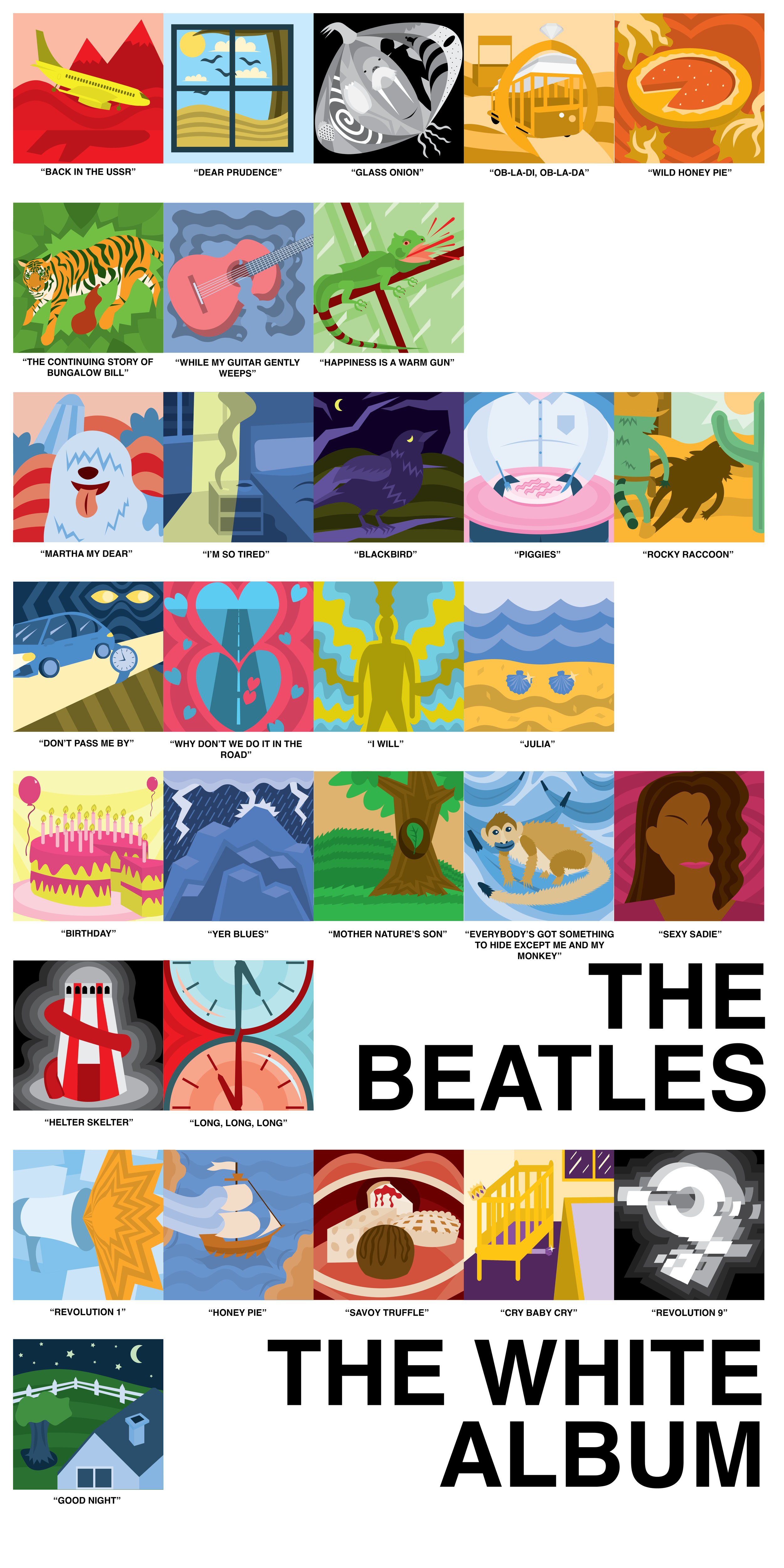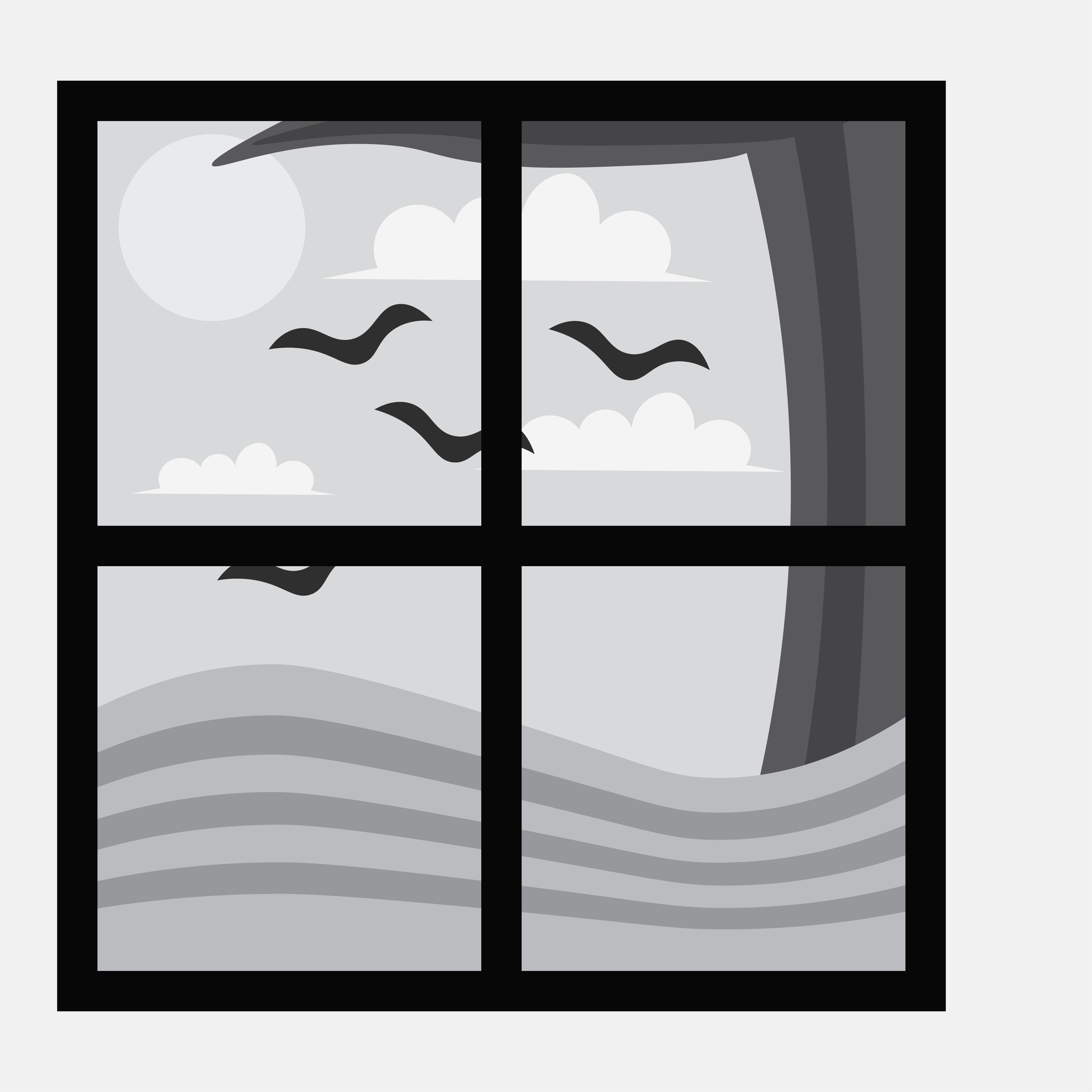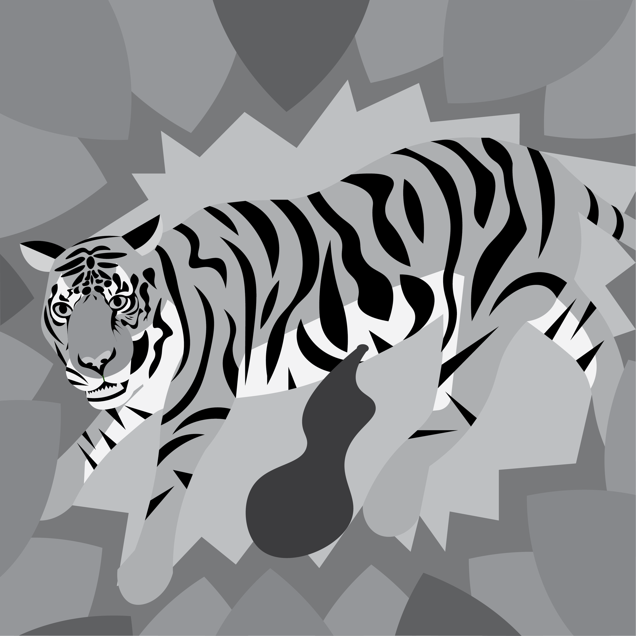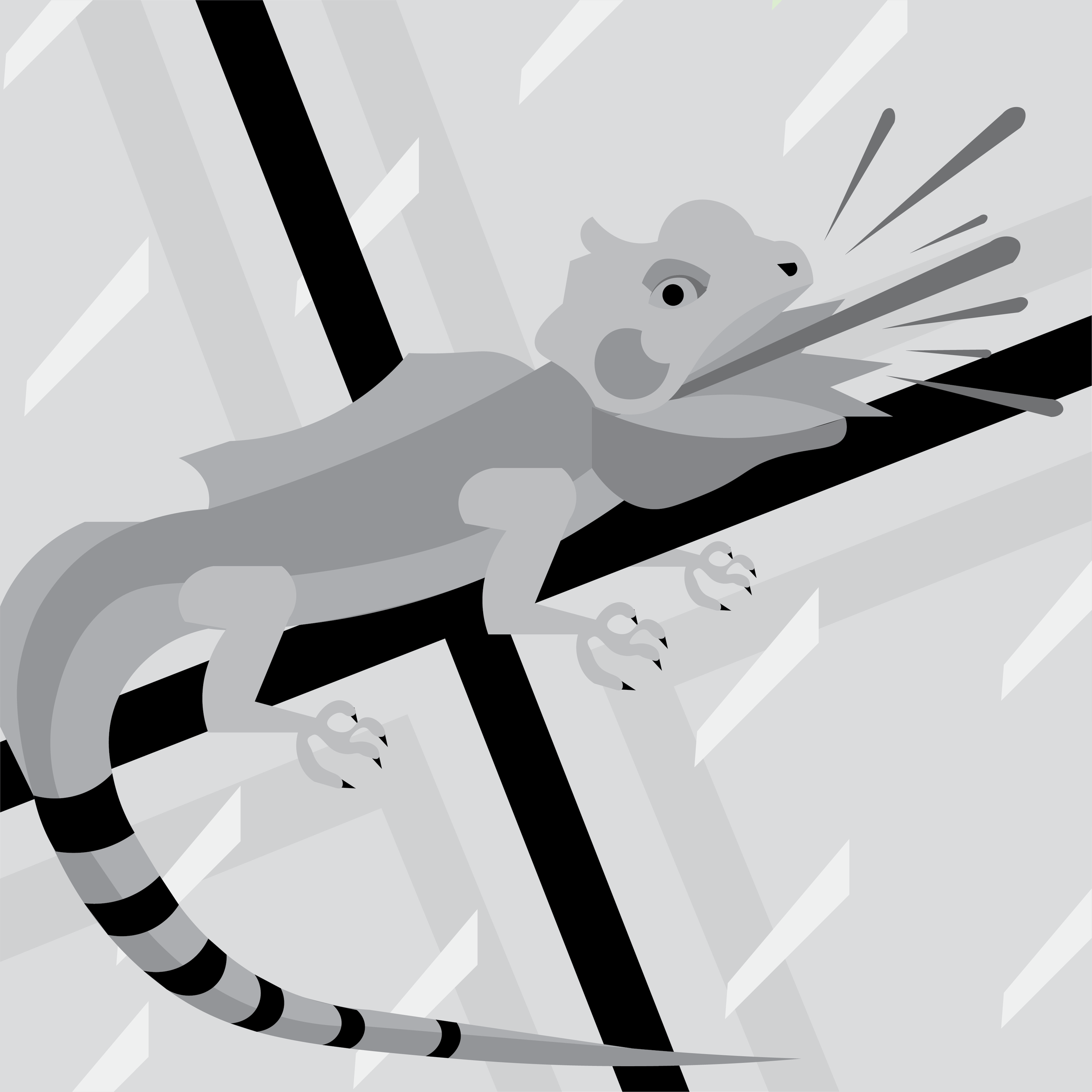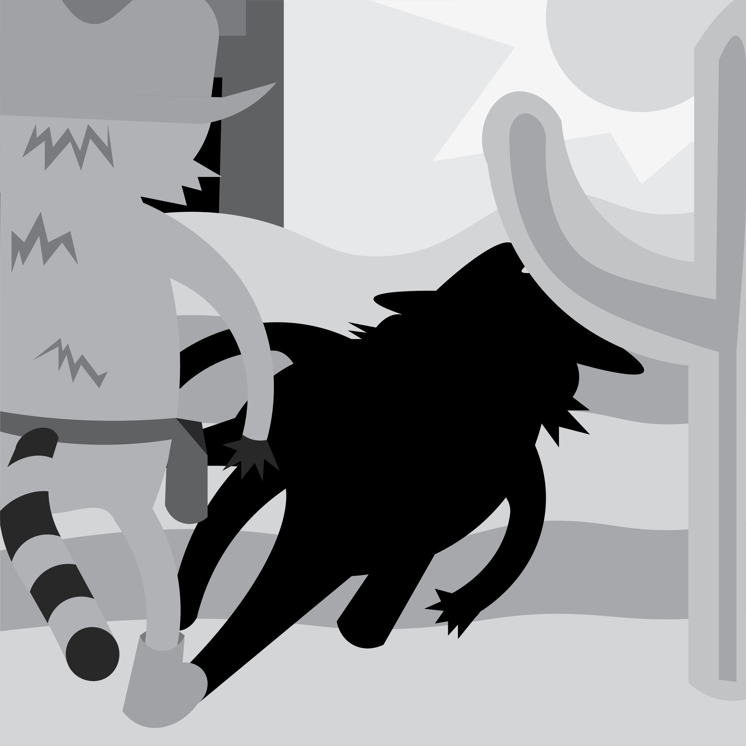
Goal: Create a project with 30 different pieces, done for 30 minutes a day over the course of 30 days.
Roles: Created illustrations, chose type and colors, and assembled illustrations in the finished poster.
Concept
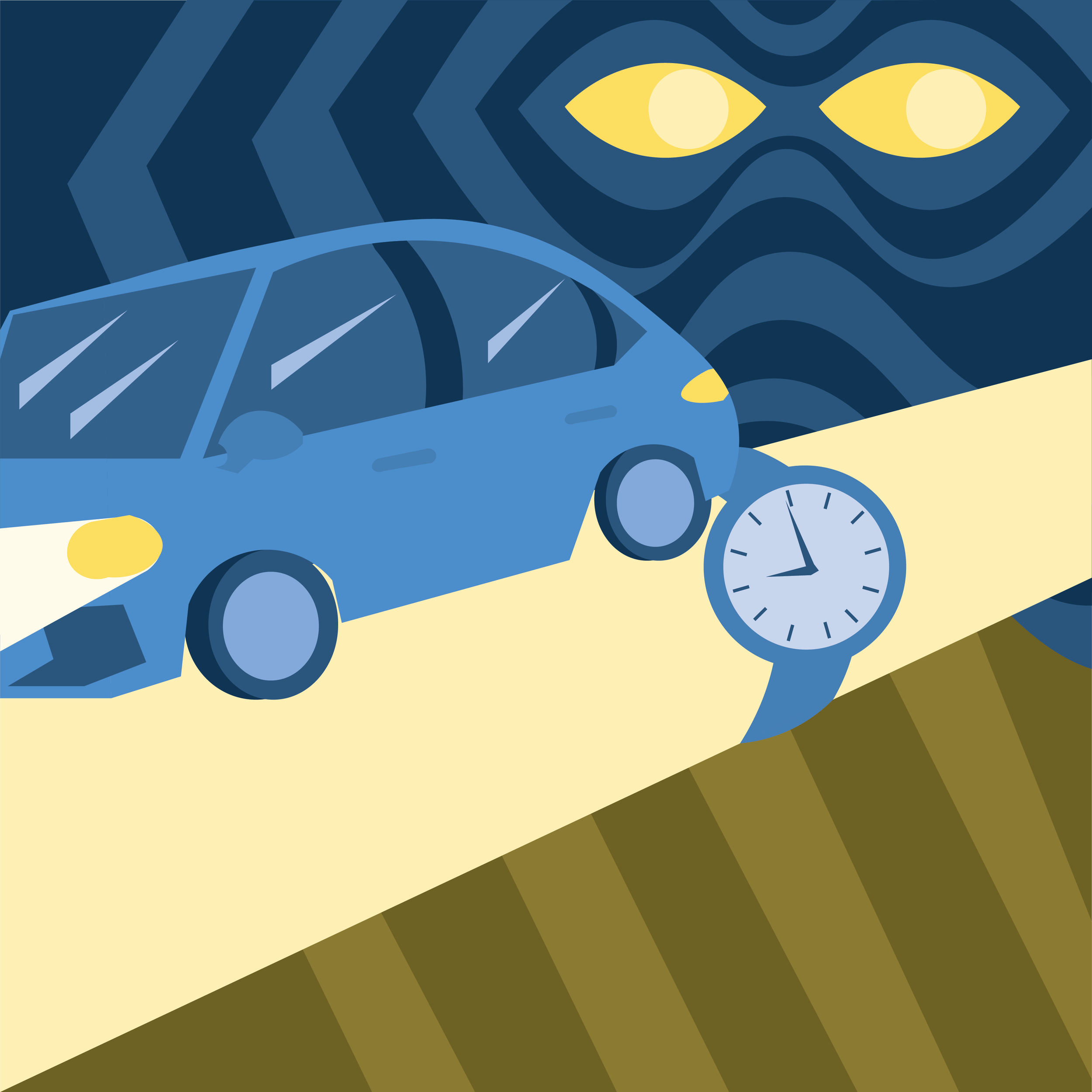
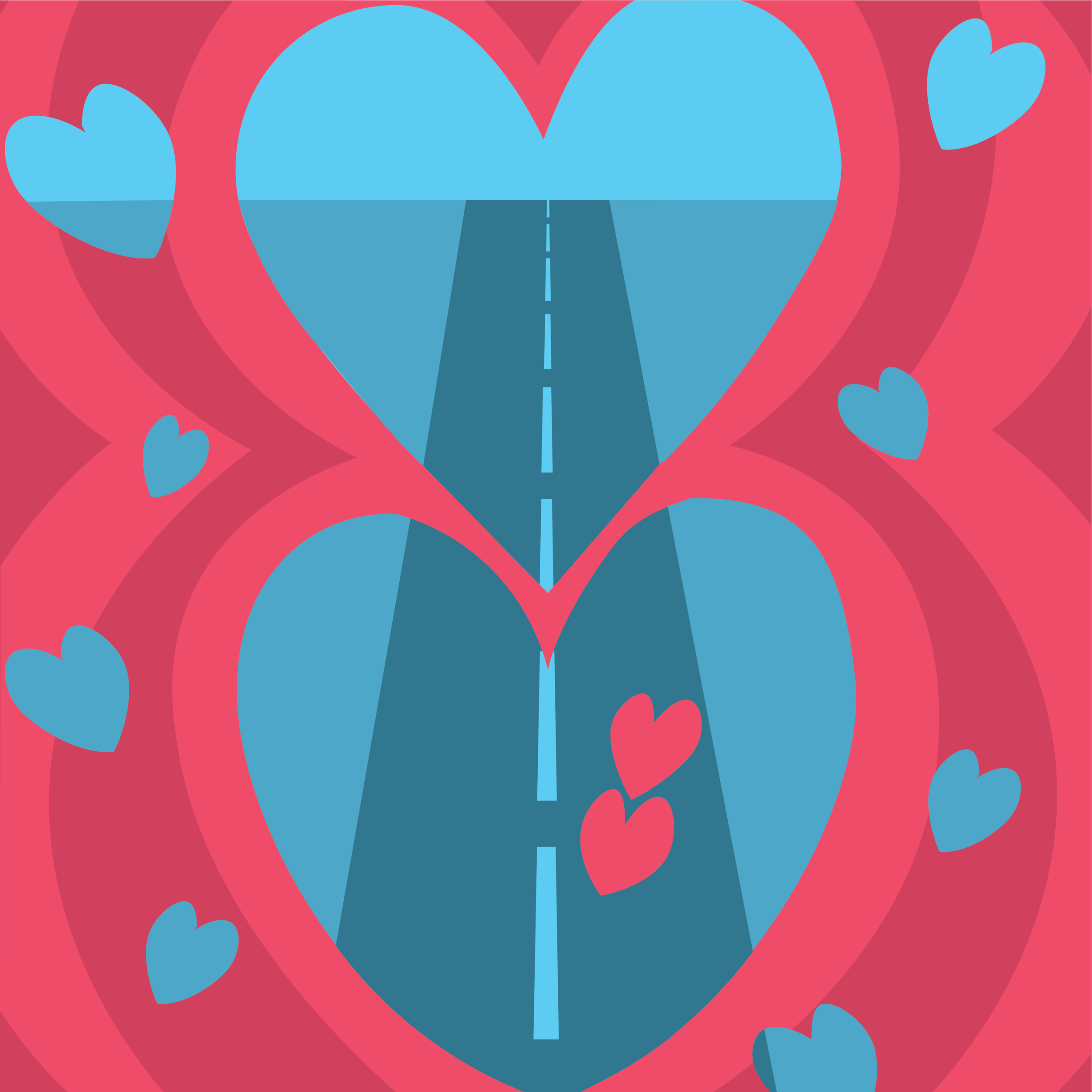
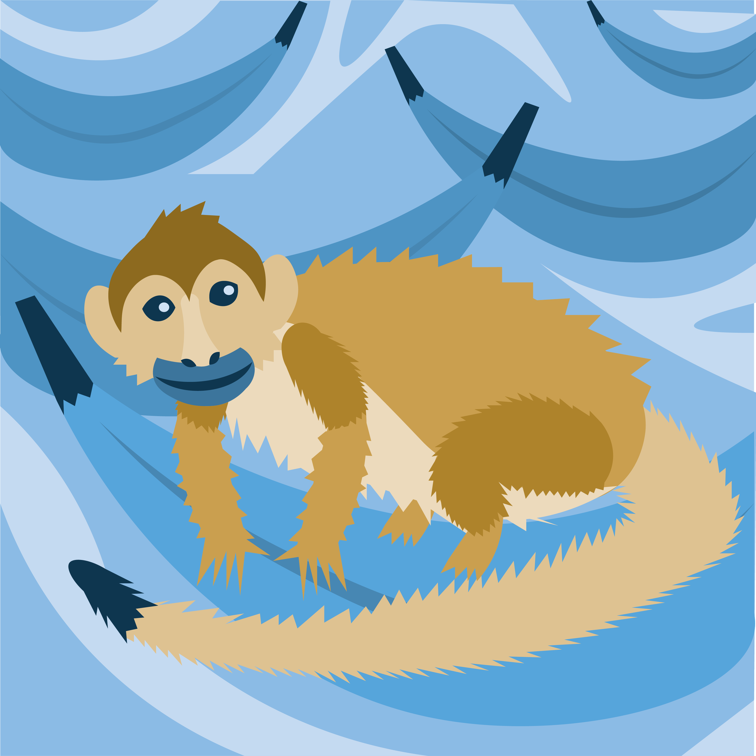
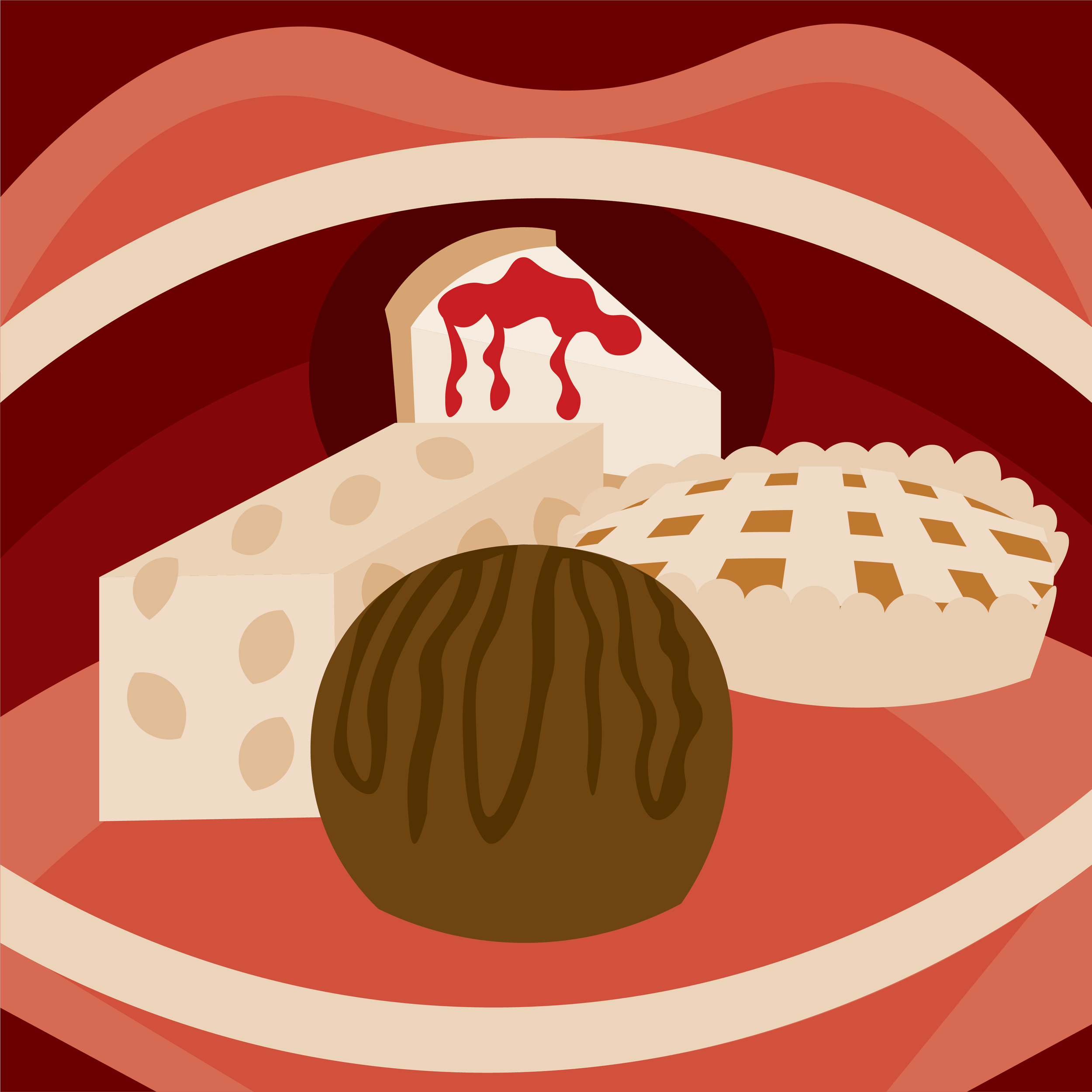
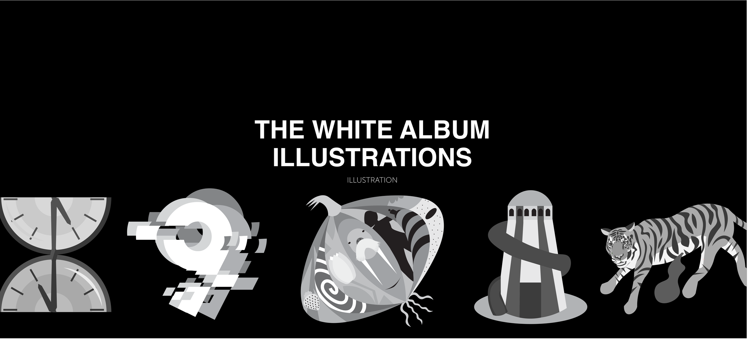
For this project I decided to make an illustration for each song on The Beatles’ self titled album, also known as the White Album. I chose this album not just because it’s a personal favorite of mine, bur also because it had exactly thirty songs, allowing me to do an illustration a day. I also wanted to improve upon two skills when working on this project; illustration and creating consistency in different designs. Another challenge I gave myself was to only use two colors for each illustration, only adjusting the lightness or darkness of each color. Two of the illustrations, for “Glass Onion” and “Revolution 9,” were made in black and white. A third color had to be used for “The Continuing Story of Bungalow Bill,” because the tiger looked strange in red and the blood looked strange in orange.
Originally, each illustration was going to be its own poster, with the title of the song included along with some information about the song. However, towards the very beginning of the project, I decided they would look better in one poster all together. I made two different posters in the end, the 24x48 poster seen above and a 24x36 poster.
Process
Although each illustration was supposed to only take 30 minutes, in practice they took an average of 45 minutes each, with the shortest one taking around 25 minutes and the longest taking about an hour and a half.
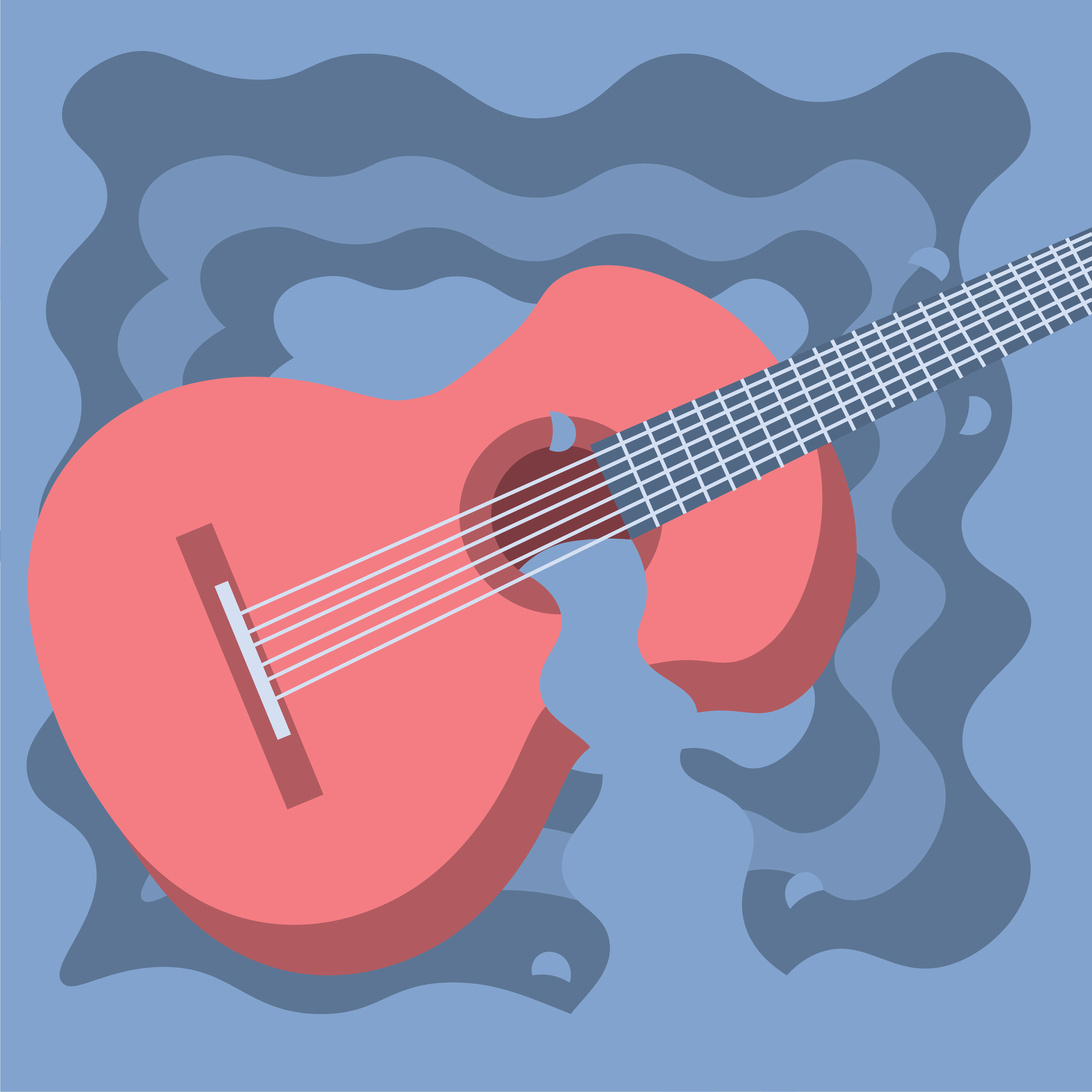
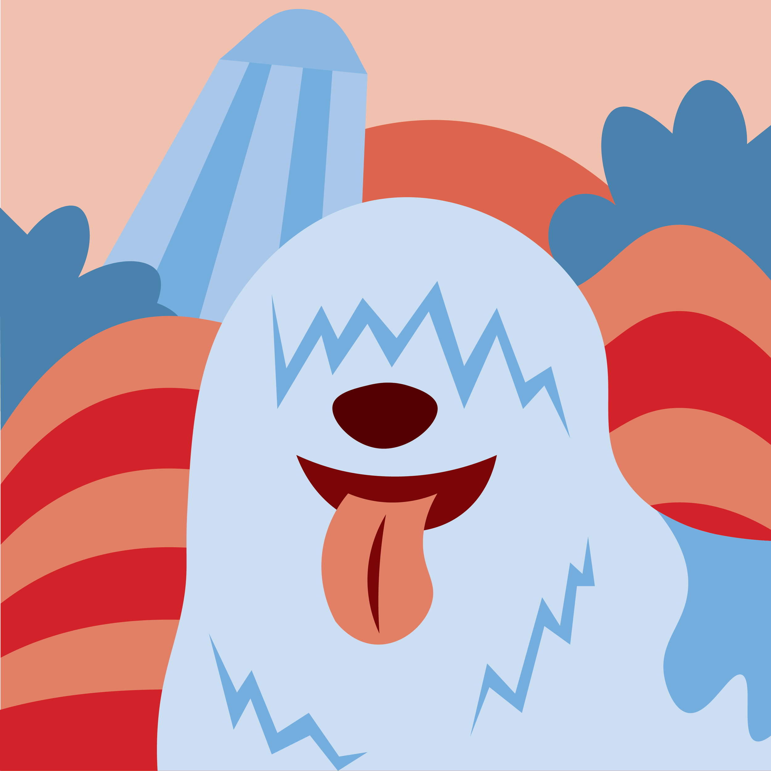
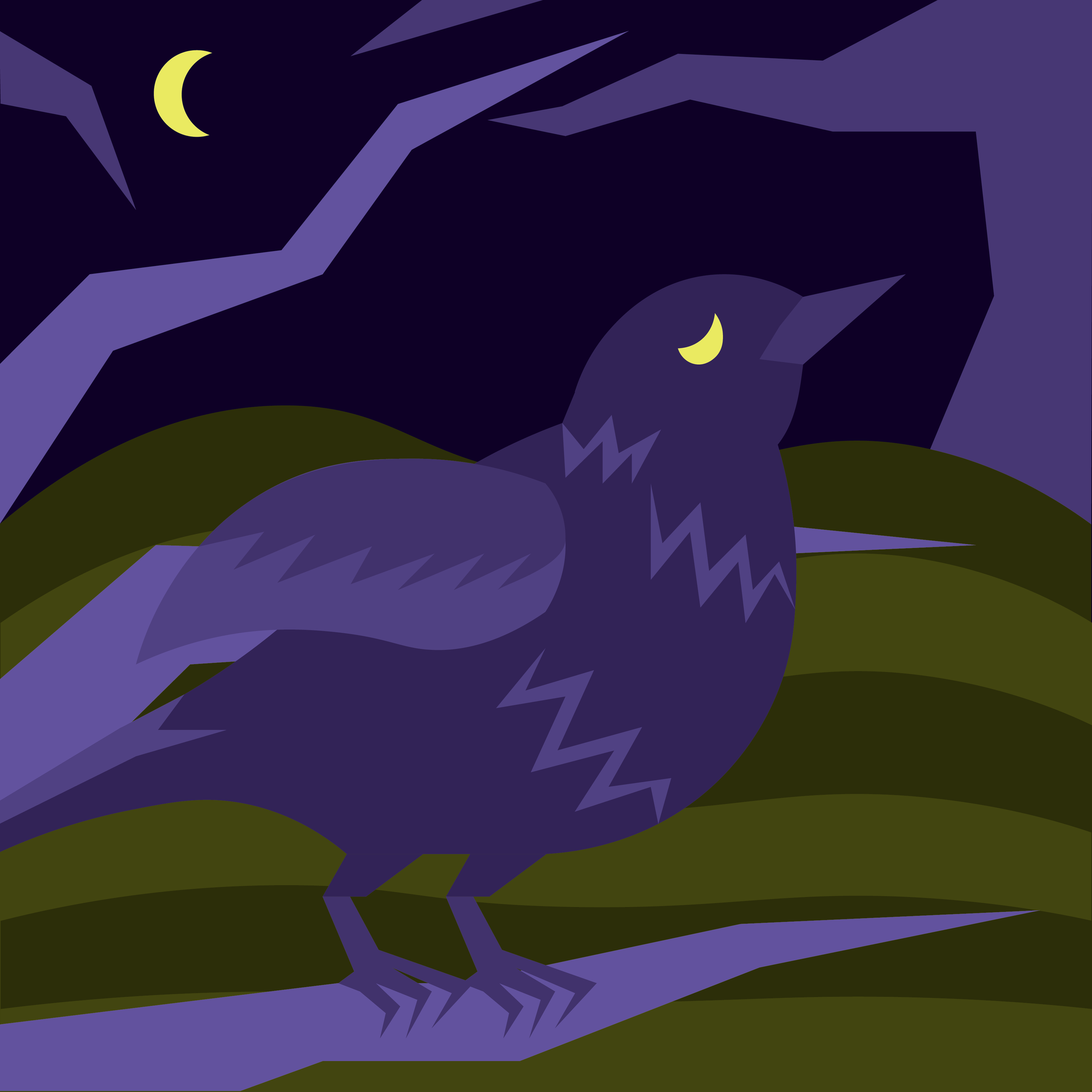
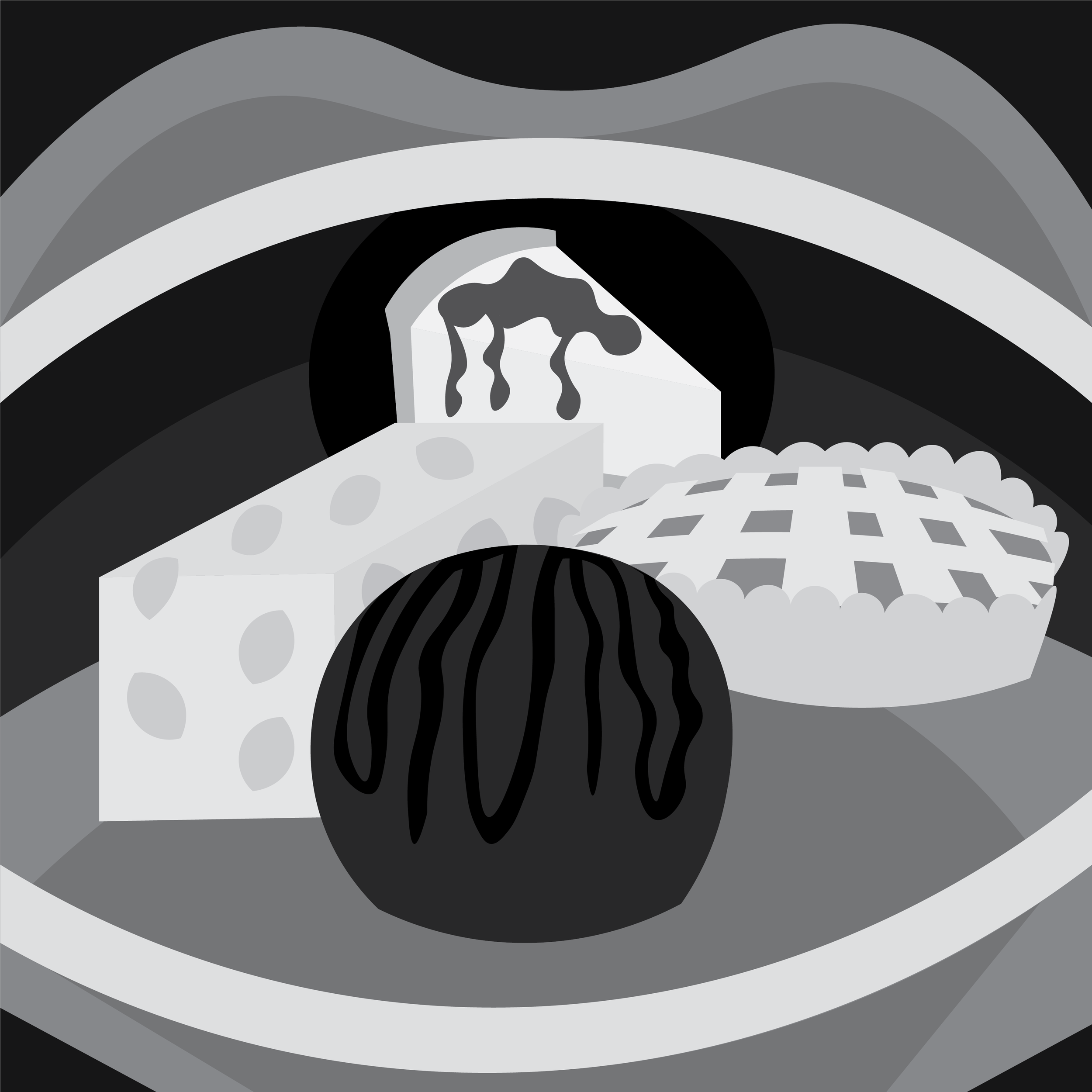
Each illustration was done in a 12x12 square, also the size of a record sleeve. The first step in each illustration involved listening to the song while looking at its lyrics. In each illustration I tried to capture the feel of the song while depicting content mentioned in the lyrics. In some cases, this involved use of metaphor when I did not want to depict the song’s subject directly. For example, a lizard represents a gun for “Happiness Is A Warm Gun,” and two hearts represent sex in “Why Don’t We Do It In The Road.” Another issue was that I did not want to include people in the illustrations, because they are incredibly time consuming to illustrate. I did break this rule a few times; silhouettes appear in the illustrations for “Glass Onion” and “I Will,” and a person’s face is featured in “Sexy Sadie.” However, the fact that humans were mostly absent from the illustrations made illustrating a song with less lyrical content such as “Long, Long, Long” very difficult, while songs that mentioned objects directly like “Savoy Truffle” were easier. Animals also frequently appear in the illustrations; nine of the illustrations include at least one animal.
After deciding the what objects to depict, I then chose colors. In some cases, color choice was very easy, like using red and yellow for “Back In The USSR.” In other cases, like “Long, Long, Long,” picking colors was harder because there was no obvious choice. Overall, the series uses a lot of blues, reds, oranges, and yellows. Colors like purple that aren’t found as often in the natural world were seen less. As I mentioned above, two of the illustrations (“Glass Onion” and “Revolution 9”) use only black and white, and a third “Helter Skelter,” uses black and white and red. For “Glass Onion,” this was to evoke the feel of glass. For the other two illustrations, this was to make them feel more creepy.
Later, I went back and made black and white versions of all of these illustrations. In some cases, I found they looked better than the color originals. They can be found on this webpage below the color versions.
Assembling the poster was not as difficult as I expected it to be. I decided to give the poster a very simple layout, both to match the feel of the original album cover and as not to take away from the vibrant color of the illustrations. The songs are in the order they appear in the album, and in the 12x48 poster above, separated out by the side of the album they appear on. The font used on the poster is Helvetica Nueue Bold, the same font used on the actual album cover (or something very similar). In using this font, I wanted to evoke the same utilitarian feel as the album’s cover.
You can listen to The White Album here.

