

Goal: Create a tourism campaign for three cities using a series of still posters and one animated poster.
Roles: Created poster concepts, chose cities, created posters and illustrations, chose all colors and type.


Concept
Urban renewal is something I’ve been passionate about for a while, and I’d been trying to develop a project on it for some time. I originally had wanted to create an animated explainer video on the issue, but after recently working on explainer videos for Empower Parkinson and InclusiveU, I wanted to try a different kind of project.
Instead, I decided to create a poster tourism campaign for three cities that are not typically thought of as tourist destinations. These are intended to be seen within and around their respective cities, such as at an airport or bus station. The campaigns include four still posters that can be used in a digital or physical format. Each campaign features one poster that focuses on the city as a whole and three that focus on various attractions within the city or surrounding area.
I also wanted to incorporate motion into this campaign, so each city also has one animated poster, which rotates through the four still poster designs and transitions between them. These would be ideally used on a digital billboard.
The animated poster for Syracuse is currently in progress, and will be up on the site shortly.
Process
The first step in developing this campaign was to choose what cities I would be working with. I originally envisioned the project as focusing on midwestern “rust belt” cities, such as Detroit, Michigan; Cleveland, Ohio; and Gary, Indiana. I very quickly eliminated my home city of Chicago from consideration, because I felt like Chicago was too high profile and conventional of a tourist destination for this campaign. I did want to include somewhere I had a connection to, and so I chose Syracuse, New York, where I went to college.
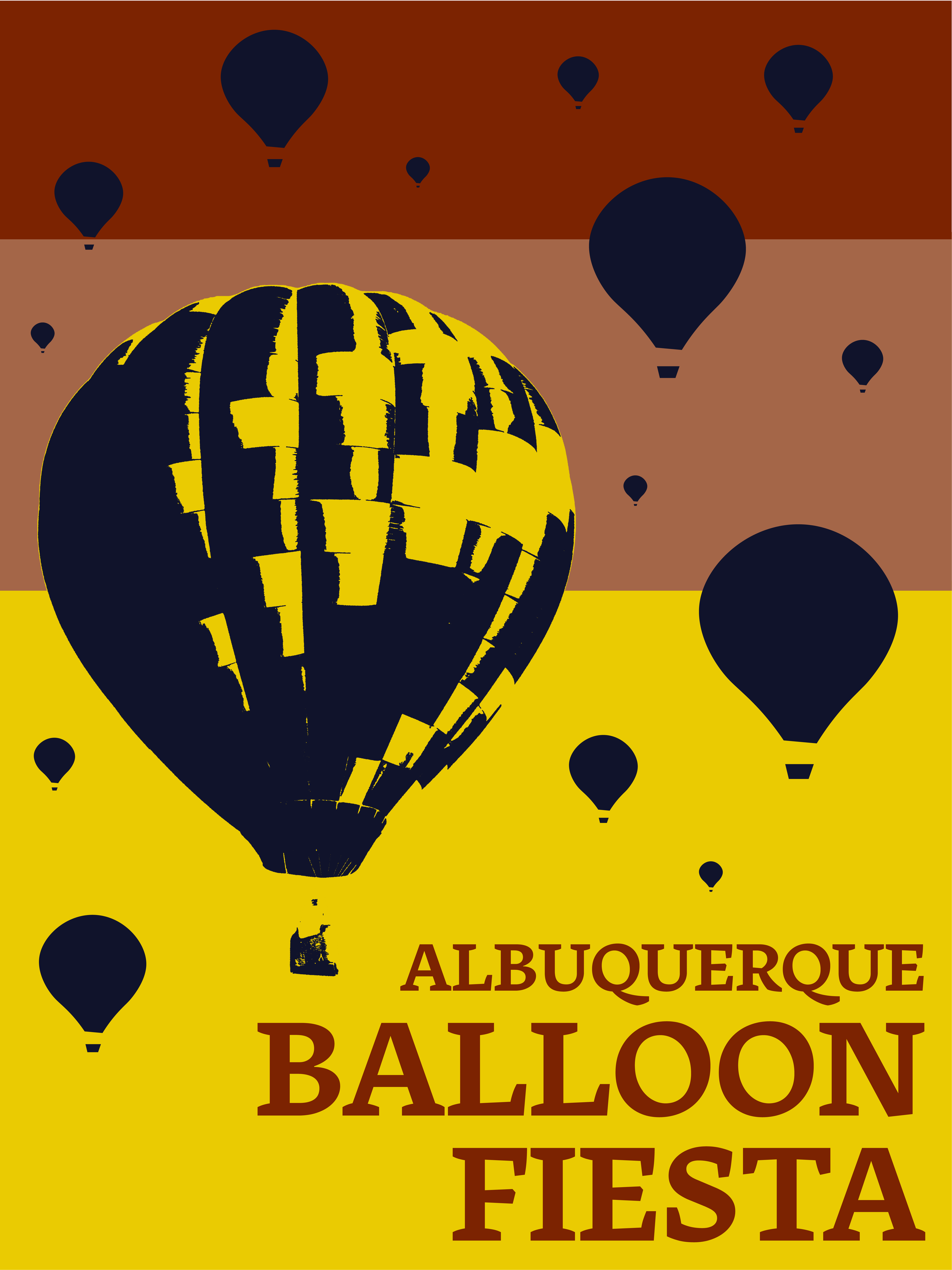
I wanted to include a different kind of city in the campaign, since I felt like developing for similar midwest cities would mean a lot of similar poster designs and attractions. So I chose to incorporate Albuquerque, New Mexico as the difference in climate, population, and history would give me visual contrast from the other cities.
Deadlines forced me to narrow down the scope of my project, so I opted for three cities: Detroit, Syracuse, and Albuquerque, as I thought these three would give me the most variety in poster design.
I then came up with a list of attractions for each city. As Syracuse is the only one of these cities I’ve actually visited, for Detroit and Albuquerque I chose a combination of popular attractions and things that interested me personally. For Syracuse I tried to choose attractions that had specifically had meaning to me. I’m glad I chose to work with both familiar and unfamiliar cities for this reason; I got to approach campaigns both as a “local” and as a prospective tourist.

A rough sketch for the main Detroit poster, incorporating Detroit’s history with the auto industry.
Thinking about where these posters might be seen in a city allowed me to develop their visual identity. I wanted them to be bold and bright, to catch the eye of a tourist. I also made the decision early on to focus more on imagery than text. While some information about each attraction could have been included, I thought a more simplistic approach would be more effective.
Color was key to establishing the bold personality I wanted these posters to have. I chose to utilize four colors per city, and to keep the campaigns cohesive with each other, two colors would be used in every campaign, while each city would have two unique colors. I also chose a unique font for each city. For Detroit I chose the somewhat ironically named typeface LTC Broadway, as I was interested in highlighting the bright lights and jazz culture of the city. For Albuquerque, the typeface I used was Tuna, which I chose for a western feel that wasn’t too on the nose. I wanted an approachable slab serif for Syracuse, and opted for Novecento Slab.

Originally I’d wanted purely illustrated imagery, but I wanted one more realistic image on each poster to provide visual contrast. I originally envisioned having cut out photographs, possibly tinted with one of the poster colors, but I began experimenting with Adobe Illustrator’s effects and found a stencil-like style I enjoyed better. Each of the stencil style images were stock photographs modified with Adobe Illustrator’s torn edges effect, and then further modified in Photoshop.
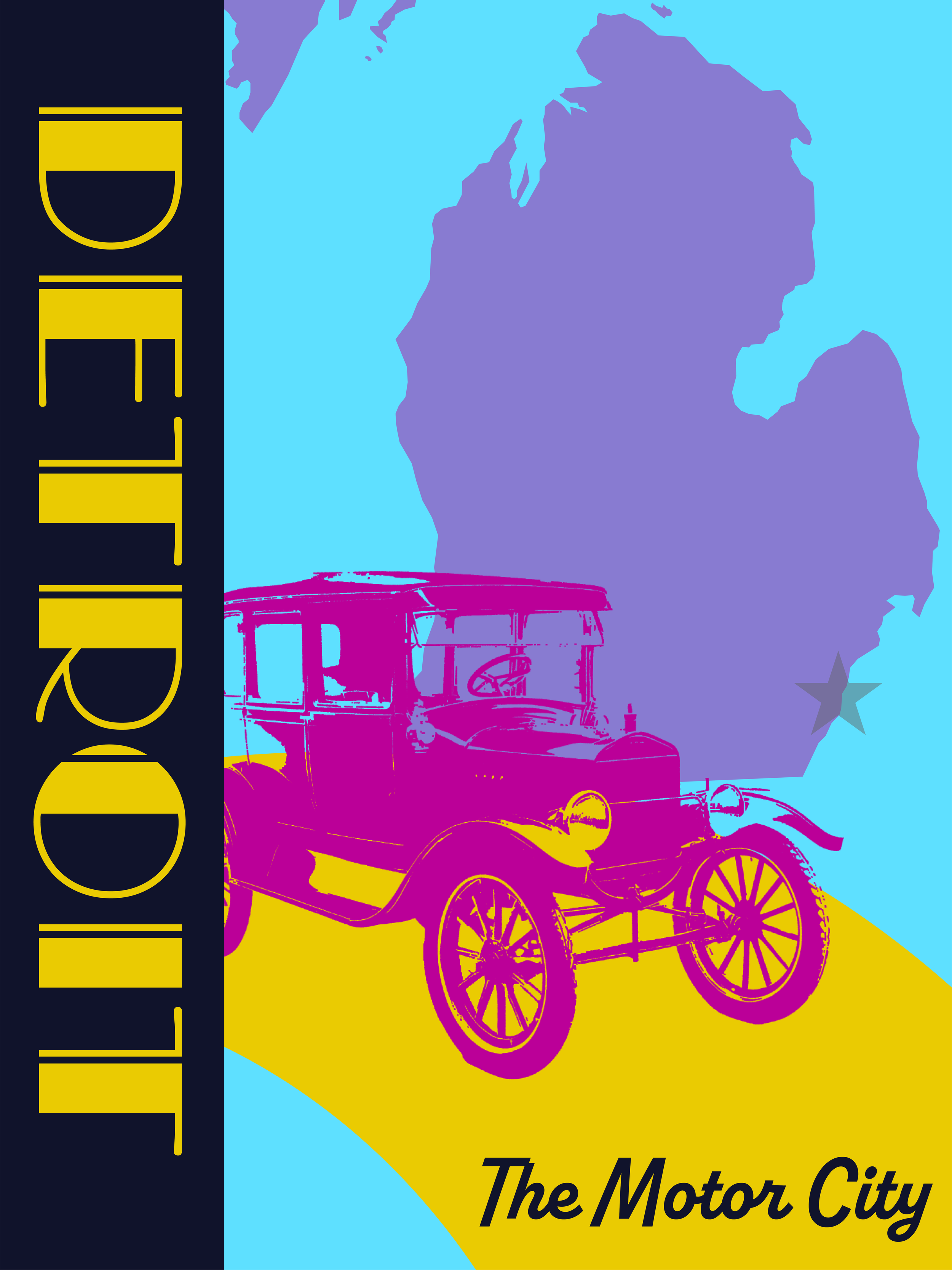


Above are the main posters for each city, which were the first ones developed. I chose to have the dark blue banner on the side with yellow text stay consistent across all three posters to create consistency within the larger campaign. I also included a nickname for each city on the bottom right corner and an image of the city’s location within its state. I also chose one visual element to incorporate for each city for further visual consistency; Detroit’s posters use swooshing curved shapes, Albuquerque’s feature layers of background and foreground, and Syracuse’s use rounded shapes.
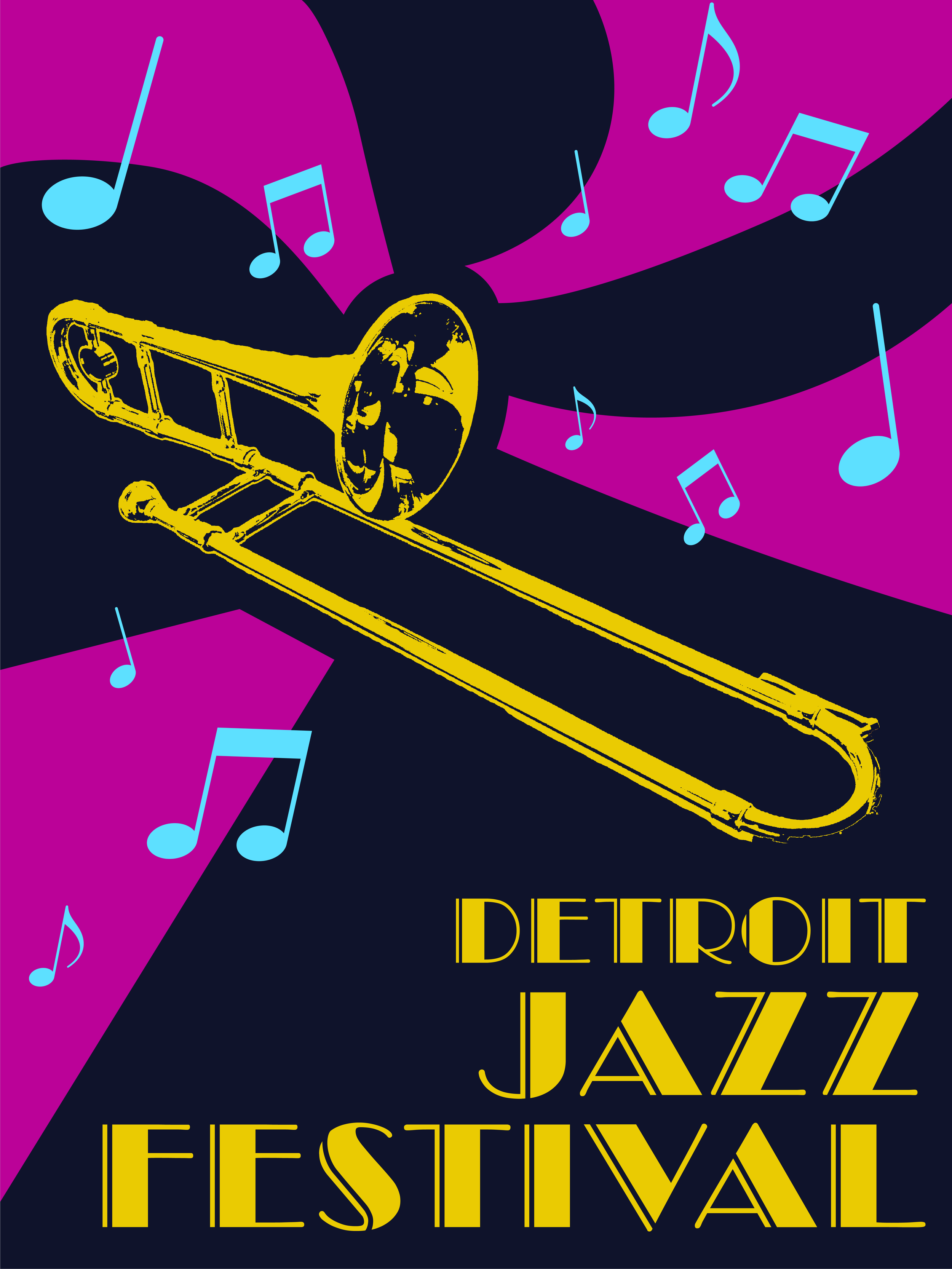

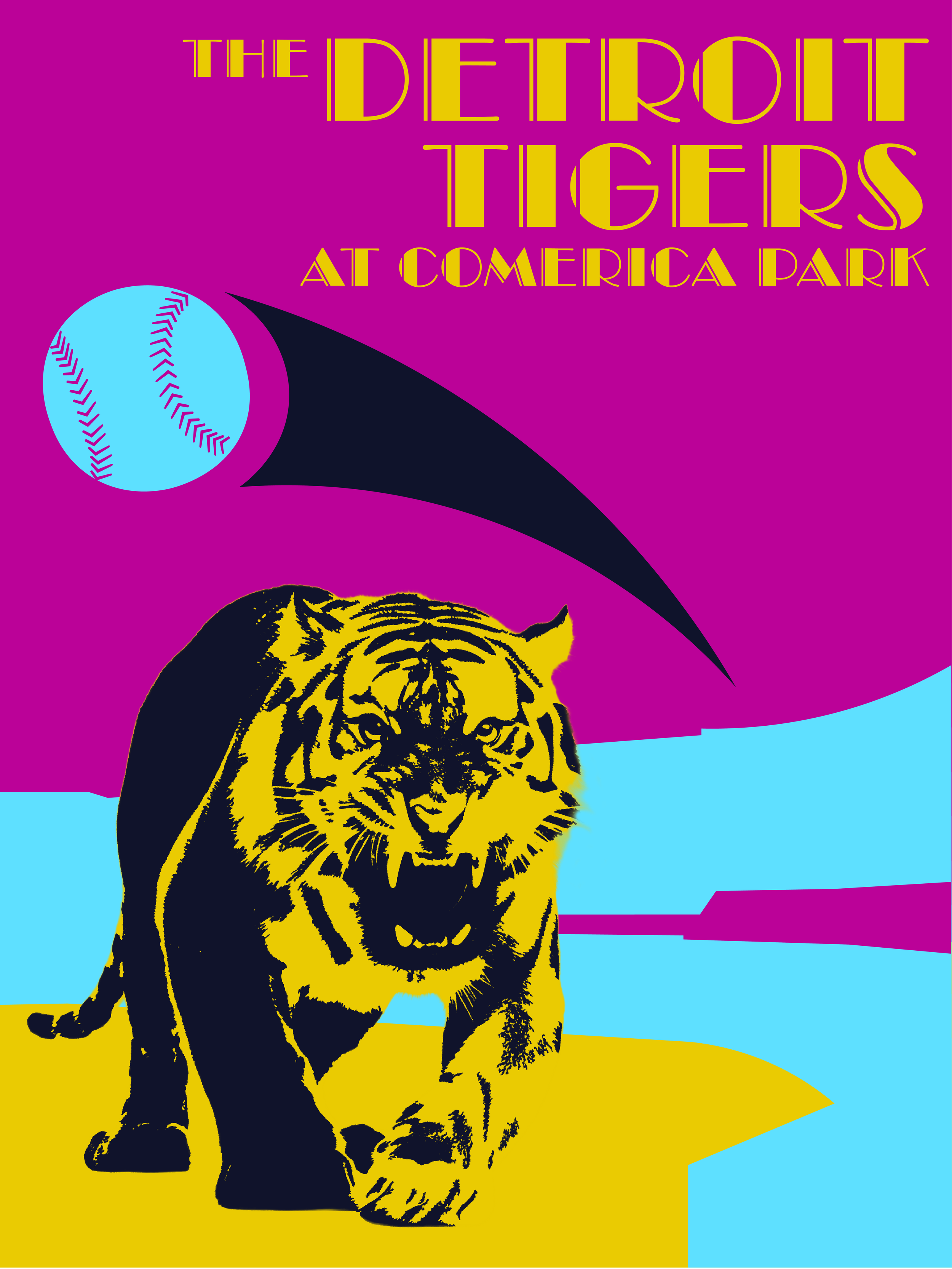


The posters for each of the attractions are bit more basic but feature many consistent elements. For the attraction posters, it was more important to me to create visual consistency within each city’s campaign than between cities. I also wanted the posters to be easy to animate and flow well into each other when animated in sequence.
For the animated posters, I tried to make to make each sequence quick and simple. I thought it would be better to highlight the images and text on the poster using animation rather than have the animations be the main feature. Each poster’s animation is around three seconds, and the final GIFs are twelve seconds.
Overall, I think this project ended up being very cohesive, and I was surprised by how much the colors and image style linked the cities together. I ultimately am very satisfied with this poster series and am definitely open to expanding it to other cities in the future, including some of the ones I considered but did not end up working with.
Below are all of the posters in sequence.